Events are behavioral data that help you trace a user's actions. This section shows a timeline of the user's most recent interactions with your app/website over the last 7 days.
Custom Date Range: You can select a custom date range of up to 30 days to view a longer event history.
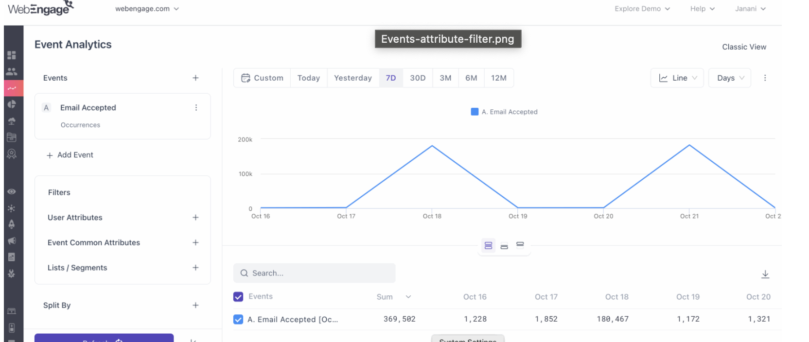
Event Attributes: Each event includes contextual data points, such as Technology, Location, and Page URL. Click the dropdown arrow to view these details.
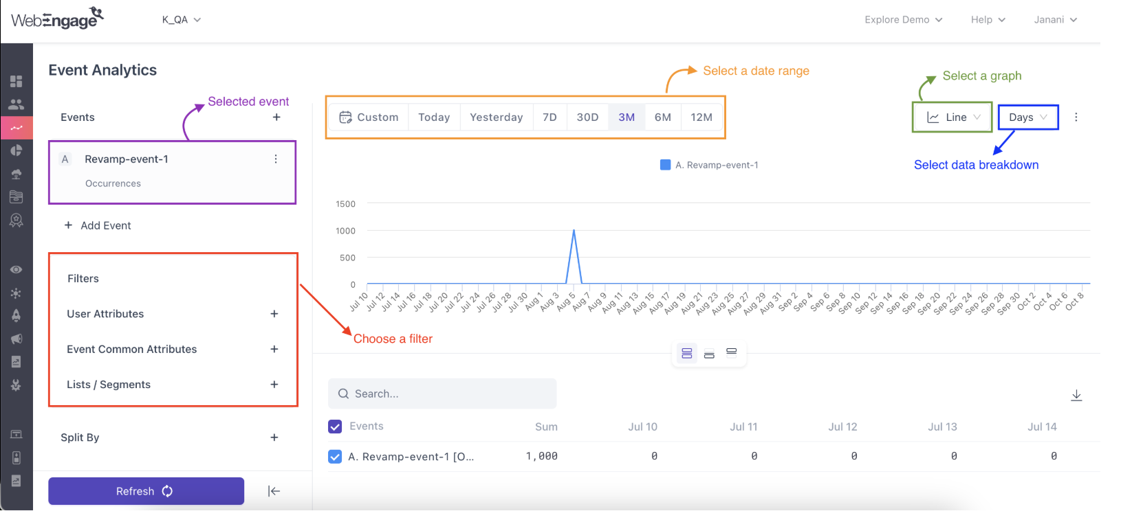
The Events section of your dashboard helps you analyze user behavior by tracking their actions on your app or website. You can select single or multiple events and view them through various filters and visualizations.
Follow these steps to analyze user events:
Select Date Range: Choose a period for your analysis. The default is Last 7 days.
Select Measurement: Choose how you want to measure your data from the dropdown.
Occurrences: The total number of times an event happened.
Uniques: The number of unique users who performed an event.
Aggregate: A summary of numeric data (e.g., sum, average, min/max).
Select Event(s): Choose one or more events from the left-hand column.
You can add multiple events to compare their data.
Use the smart search feature to find relevant events quickly.
The Superfans app supports a wide range of custom events to help track user activity and shopping behavior. These include:
User Login – when a user signs into the app.
User Logout – when a user signs out of the app.
Page Opened – whenever a new page is opened.
Bottom Bar Switched – when the user switches tabs from the bottom navigation bar.
Top Navigation Switched – when navigation occurs using the top menu.
Side Navigation Opened – when the side menu is expanded.
Side Navigation Closed – when the side menu is closed.
Product Viewed – when a user views a specific product.
Collection Viewed – when a collection or category page is viewed.
Variant Changed – when a user switches product variants (e.g., size, color).
Added to Wishlist – when an item is added to the wishlist.
Removed from Wishlist – when an item is removed from the wishlist.
Cart Updated – whenever the cart is updated with changes.
Added to Cart – when an item is added to the cart.
Cart Quantity Updated – when the quantity of a cart item is changed.
Removed from Cart – when an item is removed from the cart.
On Checkout Click – when a user clicks the checkout button.
Search Performed – when a search is initiated.
Collection Sorted – when a collection is sorted (e.g., by price, popularity).
Collection Filtered – when filters are applied to a collection.
Search Results Sorted – when search results are sorted.
Search Results Filtered – when filters are applied to search results.
Purchase Event – when a completed purchase takes place.
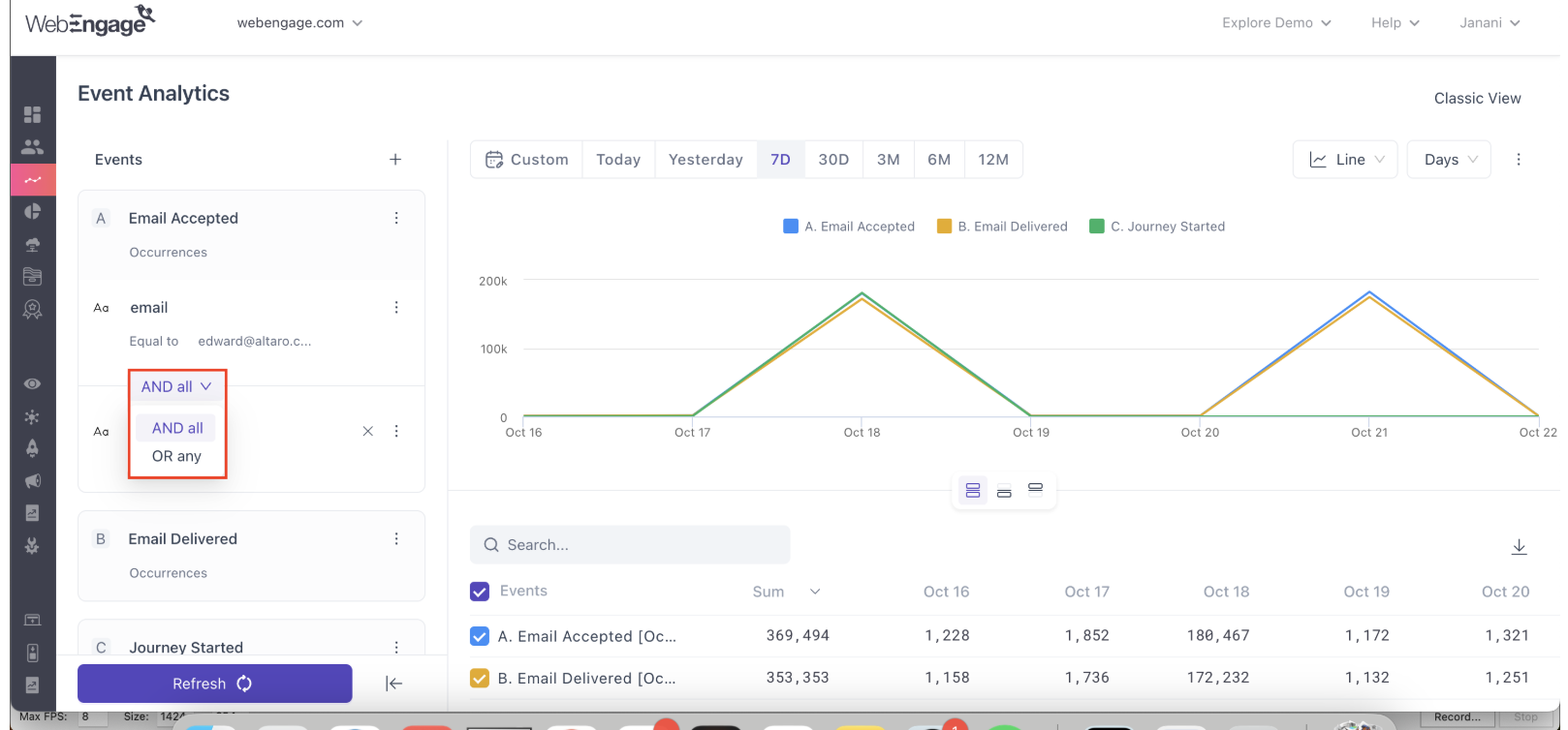
You can apply various filters to your event data.
Filter a single event by its attributes using AND or OR logic.
AND logic: Narrows your analysis by including only events that match all selected filters.
OR logic: Broadens your analysis by including events that match any of the selected filters.
Apply a common filter to all selected events using a separate panel.
User Attributes: Filter based on user data (e.g., location, gender).
Event Common Attributes: Filter by attributes common to multiple events.
Lists / Segments: Filter by users included in specific segments or lists.
The Split By option lets you break down event data by up to two dimensions (e.g., country, device, or campaign source) for deeper insights.
After setting up your analysis, choose a visualization format.
Bar Graph: The default visualization, now horizontal, is useful for comparing series and seeing an aggregated total for the selected date range.
Line Graph: Ideal for showing trends over time.
Table: Displays a detailed, sortable table of your data.
Metrics: A new option that displays a single, concise metric for an event. This is useful for dashboards and is available for up to 10 series.
You can save your event analytics query as a Static or Refreshing list of users.
Hover over the graph and click the Zoom In option to select data points or series.
Provide a name for your list.
Choose the list type:
Static: A one-time list of users for a single campaign.
Refreshing: Automatically updates on a set schedule (daily, weekly, or monthly).
Click Create List.
The list will be saved and visible under the Segments section of your dashboard.
User Onboarding Optimization: Track new users' onboarding journey to find points of friction and improve the experience.
Product Feature Adoption: Analyze which user segments are adopting new features to create targeted campaigns and increase engagement.
User Engagement Journey Mapping: Identify key touchpoints and behaviors to inform your overall marketing strategy.
Refer to this article to learn how to send event-triggered automated push notifications.
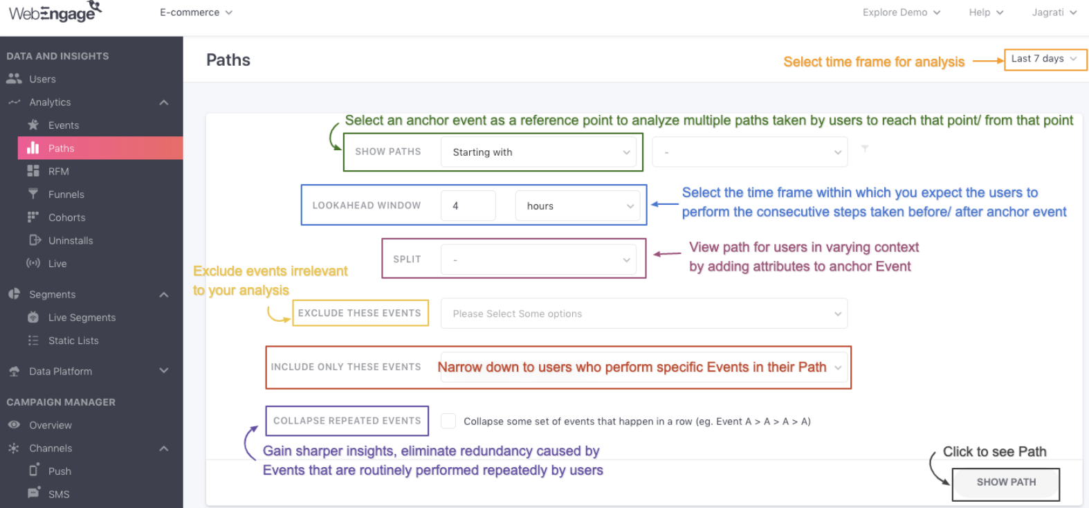
The Paths feature in WebEngage helps you visualize the most common routes users take on your app or website. By analyzing these sequential actions, you can:
Understand user behavior.
Identify drop-off points.
Connect the dots between interactions.
What do users do before they convert?
Where do users drop off in onboarding or checkout flows?
How do users discover a specific feature or product?
User journeys are displayed as a Sankey diagram, where:
Each action is a Step.
The flows are based on tracked Events and a defined time window.
The width of a line shows how many users followed that route.
Select Time Frame
Use the top-right date filter (Today, Last 7/30/90 days, or Custom).
Specify the Scope
Starts With → See actions after an anchor event.
Ends With → See actions before an anchor event.
Select Anchor Event → Choose the starting or ending point of analysis.
Add Attribute Filters (Optional)
Refine by attributes (e.g., cart value > $1000, location = US).
Combine with AND/OR logic.
Set Lookahead Window
Define how long before/after the anchor event to capture user actions (minutes or hours).
Advanced Options (Optional)
Filter by Segment/List → Run analysis on specific user groups.
Split Events by Attributes → Break down flows by country, browser, campaign, etc.
Exclude/Include Events → Hide noise (e.g., Session Started) or focus on specific actions.
Collapse Repeated Events → Simplify paths by merging repeated actions.
After running your query, results appear in two sections:
Steps: Each event performed before/after the anchor event.
Drop-offs: % of users who exit at a given step.
Conversion Rate: Movement of users between steps.
Modify View:
Add/remove steps (+/-).
Right-click to exclude events.
Lists the top 10 most common journeys.
Shows step-wise conversion rates.
Quickly highlights high-volume paths and friction points.
Use Paths to see what users actually do vs. what you expect.
Identify where they drop off and why flows break.
Optimize journeys by targeting users with personalized communication or fixing UX friction.