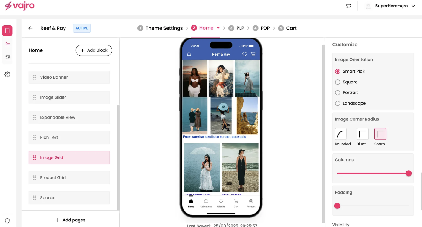
Showcase a curated collection of products or inspirational lifestyle photos in a dynamic, multi-column layout with the Image Grid block. This widget is perfect for creating a visually rich and engaging shopping experience, allowing customers to browse and discover new items at a glance.
Customize your image grid and its individual tiles using the controls on the right panel.
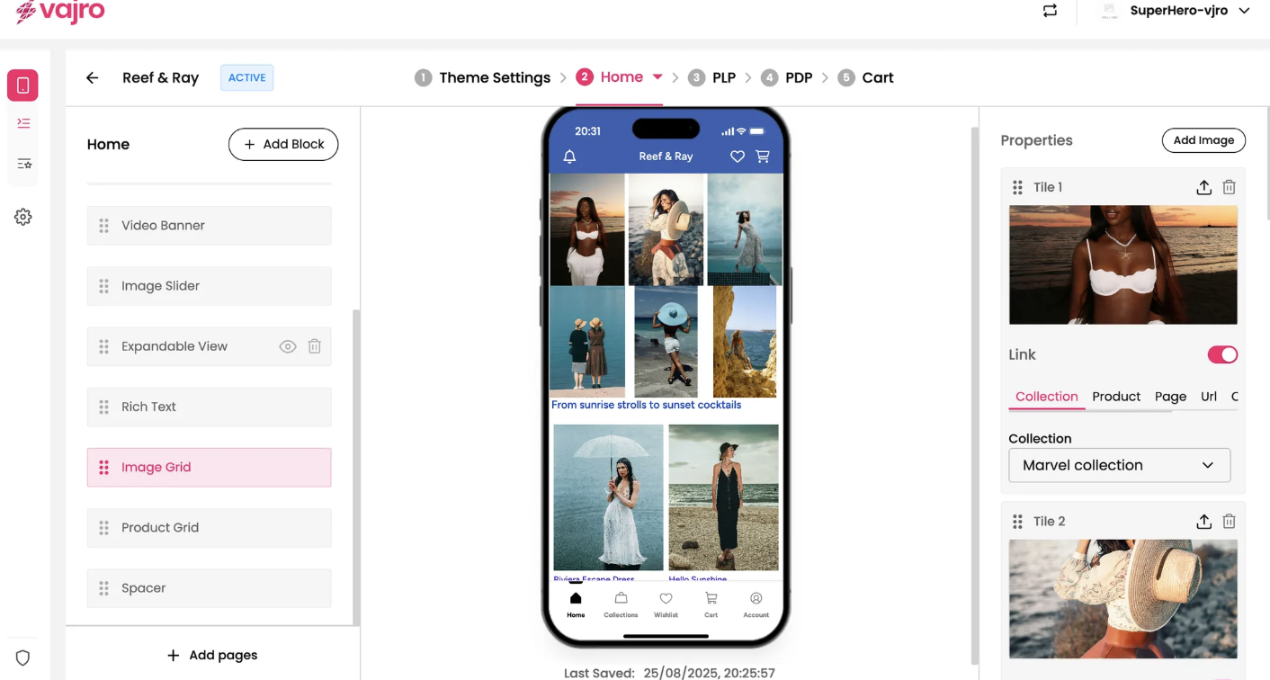
This section is where you manage the individual images within your grid.
Add Image: Click the Add Image button to add new tiles to your grid. You can add as many as you need to build your desired layout.
Tile [Number]: Each image you add to the grid is called a "Tile."
Upload Image: Click the upload icon next to each tile to add your image.
Drag to Reorder: Easily rearrange the order of your tiles by dragging the six-dot handle next to the title.
Delete Tile: Click the trash can icon to remove a tile from the grid.
Link: The Link toggle works for each individual tile. When enabled, your customers will be taken to a specific page when they tap on that particular image.
Link To: Choose where you want the tile to lead. You have the same versatile options as the Image Banner and Slider:
Collection: Direct customers to a specific product collection.
Product: Link to a single product page.
Page: Send customers to a custom app page.
URL: Use a custom URL to link to an external website or a specific deep link.
Custom Blocks: Link to a different block within the same app page.
Fine-tune the appearance of your entire Image Grid block to perfectly match your brand aesthetic.
Image Orientation: This setting controls how all the images in the grid are displayed.
Smart Pick: Intelligently adjusts each image to fit the best orientation, ensuring a seamless look.
Square: Displays all images in a 1:1 ratio.
Portrait: Optimizes all images for a vertical (tall) display.
Landscape: Optimizes all images for a horizontal (wide) display.
Image Corner Radius: Control the style of the grid images' corners.
Rounded: Gives the images soft, curved corners.
Blunt: Uses a slightly less rounded corner.
Sharp: Keeps the corners perfectly square and crisp.
Columns: Use the slider to control the number of columns in your grid. Fewer columns create larger images, while more columns create a denser, more compact layout.
Padding: Use the slider to adjust the spacing between each image in the grid. Higher padding creates more space, while less padding makes the images appear closer together.