Make the most of your app’s screen space with this versatile block. Display a single hero image while keeping details like product descriptions, collection info, or call-to-actions neatly collapsed, users can expand them with a single tap.
Customize your Expandable View and its expandable sections using the controls on the right panel.
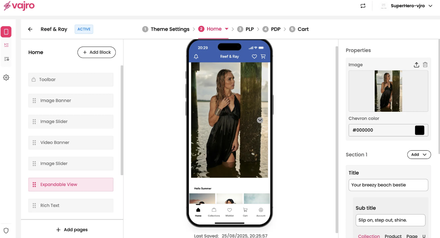
This section is where you manage the main image and the content of your expandable sections.
Image:
Upload Image: Click the upload icon to add the main image for this block. This image serves as the initial visual anchor for the expandable content.
Chevron Color: This setting allows you to select the color for the up/down arrow (chevron) icon that indicates the view can be expanded or collapsed. Use the hex code input or color picker to match your brand's aesthetic.
Section (number):
Click the Add dropdown to add a new expandable section. You can add multiple sections to the same block, each with its own content and link.
Title: Enter a bold, engaging title for the expandable section (e.g., "Your breezy beach bestie"). This text is always visible and entices the user to expand the view.
Sub title: Add a brief subtitle or a short call-to-action below the main title (e.g., "Slip on, step out, shine.")
Link: The entire expandable section can be linked to a specific destination.
Link To: Choose where you want the section to lead. You have the same options as other blocks:
Collection: Direct customers to a specific collection.
Product: Link to a single product page.
Page: Send customers to a custom app page.
URL: Use a custom URL to link to an external website or a deep link.