Color and Fonts are very important for a mobile app because it’s more than just “making it look nice”—it influences how users perceive, trust, and engage with your brand.
This document walks you through the following :
Setting Your Primary, Secondary, and Tertiary Brand Colors
Setting up colors for Toolbar Background and Icon
Choosing Font Styles for Your App
Choosing the style and Colour for buttons
The Primary color is the main color that represents your brand identity. It’s the most recognizable color in your app and is used in major UI elements.
The Secondary color is a supporting color that complements the primary color. It is used for accents, highlights, or to differentiate sections. It adds flexibility to the design without overwhelming users.
Tertiary Color is a third color that provides variety and balance. It is used sparingly for special highlights, alerts, or promotional elements.
Steps to set-up these Colors are as follows.
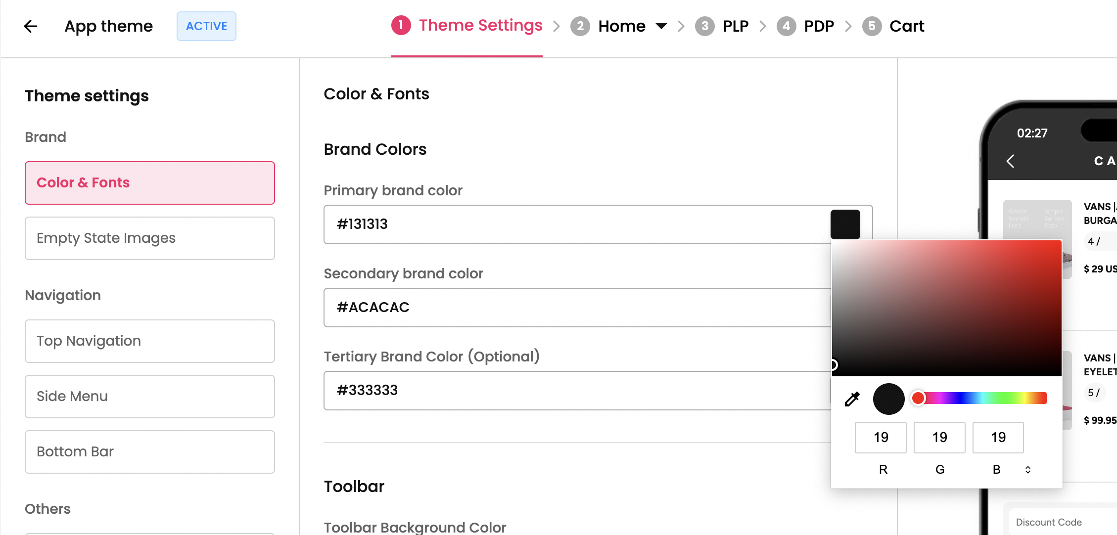
Step 1 : Select the theme which you want for your mobile app from theme section and click on “Theme Settings”. You’ll be redirected to the Colors and Font section in the dashboard.
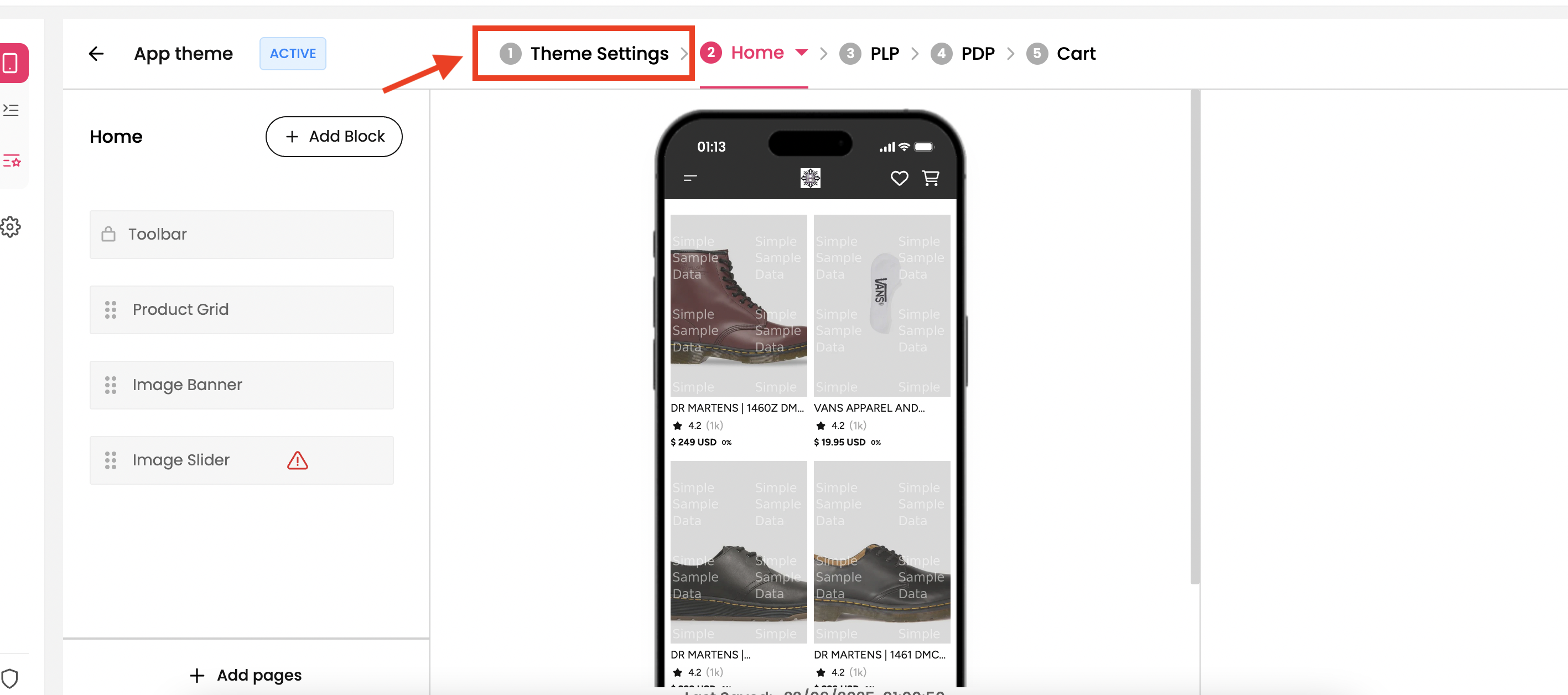
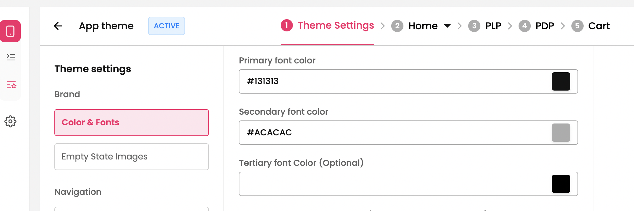
Step 2 : The first section is Brand Color and you can set the colour Primary, Secondary and Tertiary colour for your brand by clicking on the input. You can select the colour from the palette
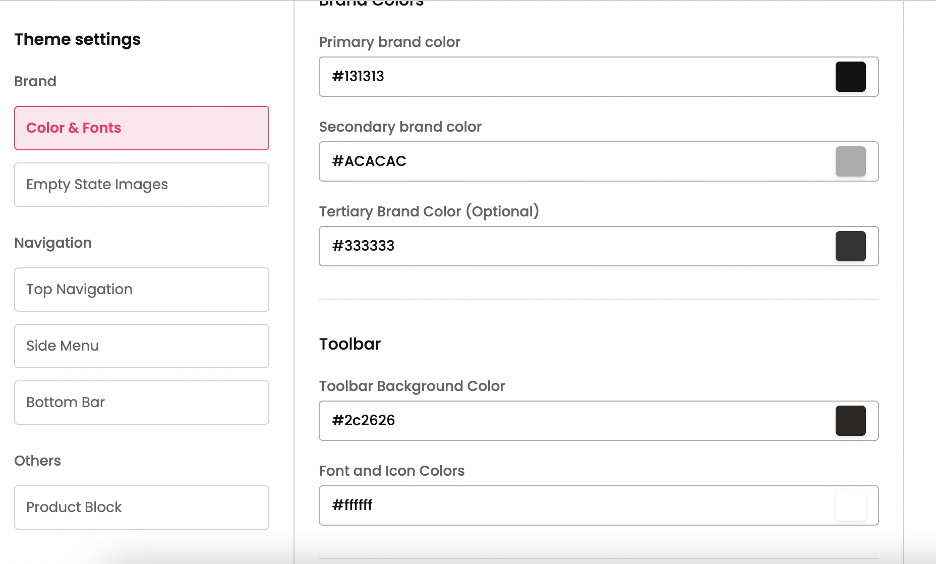
The toolbar is the top navigation bar which will be across all the pages of the app. This section provides steps to setup the colour for Toolbar.
Step 1 : Select the theme which you want for your mobile app from theme section and click on “Theme Settings”. You’ll be redirected to the Colors and Font section in the dashboard.
Step 2 : The second section is for Toolbar where you can set the toolbar colour and colour for the icons and font on the toolbar. You can select the colour from the palette.
Setting up fonts for your app is important because fonts directly affect readability, user experience, and brand identity.
You can set up font for your app and colour for the fonts by following the steps below.
Step 1 : Select the theme which you want for your mobile app from theme section and click on “Theme Settings”. You’ll be redirected to the Colors and Font section in the dashboard.
Step 2 : The third section is for Font where you can set the font you prefer for the app and colour for the fonts.
Setting up the Font
Similar to setting-up colour for the app, you can have two different fonts for the by setting one for Primary Font and one for Secondary font and assign color for the respective ones.
Primary Font → This is the main font which is used for headlines, big titles, key brand messages.
Secondary Font → This is the font which is used for body text, descriptions, and smaller UI elements.
We have a set of built-in fonts which you can choose from the dropdown and configure for the app.
Pro-Tip: For brands that want something more unique while staying mobile-friendly:
Poppins → Very popular in modern e-commerce apps (rounded, clean, approachable).
Open Sans → Classic, reliable, widely used in web + mobile.
Lato → Sleek, professional, good for fintech or business apps.
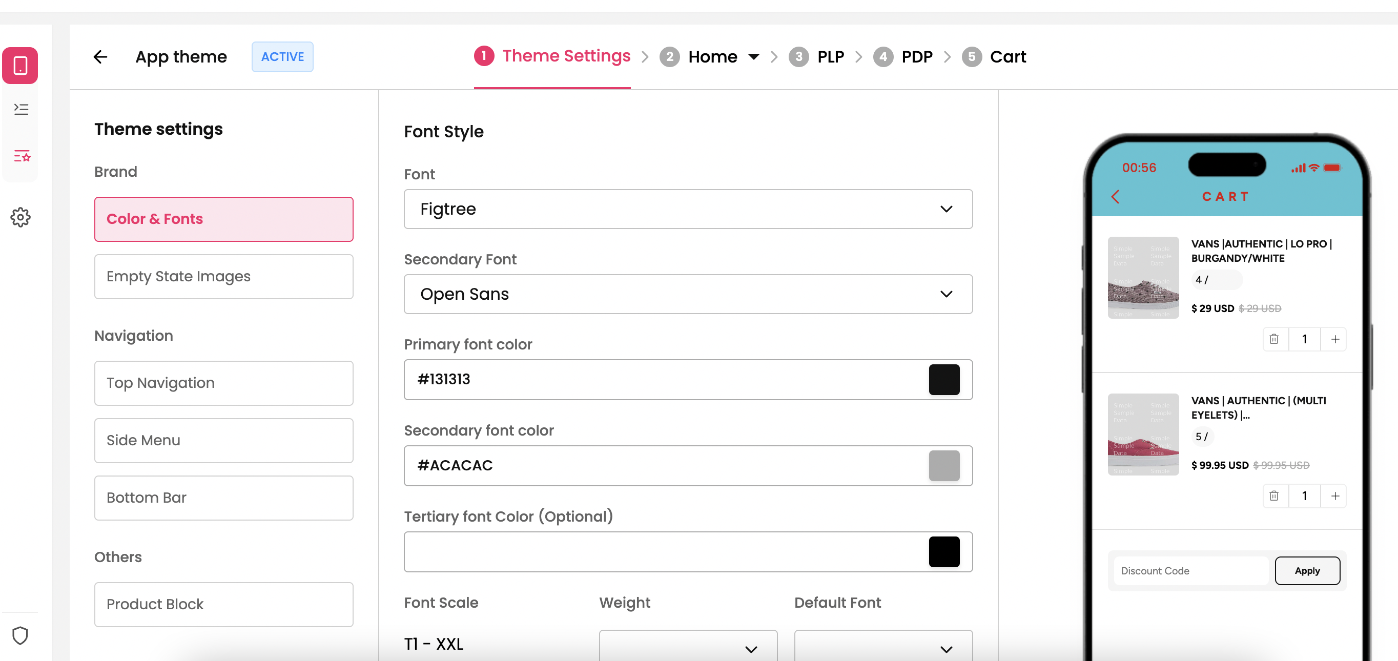
Setting up the Font Colour
Any mobile application needs high readability and for that it is necessary to set-up font color. Similar to fonts, you can set up color for Primary Font and Secondary Font by clicking the color palette.
Primary Font color→ The main color used for all important content. This is usually darker in shade which helps readability.
Secondary Font color → A softer/lighter text color used for supporting info. This is usually subtle.
Pro Tip:
For Primary Font Color → Avoid pure black (#000000) in some cases → instead use off-black (#1D1D1F) for a softer look.
For Secondary Font Color → Slightly lighter than the primary. Example: #6E6E73 or #666666 which is standard one.
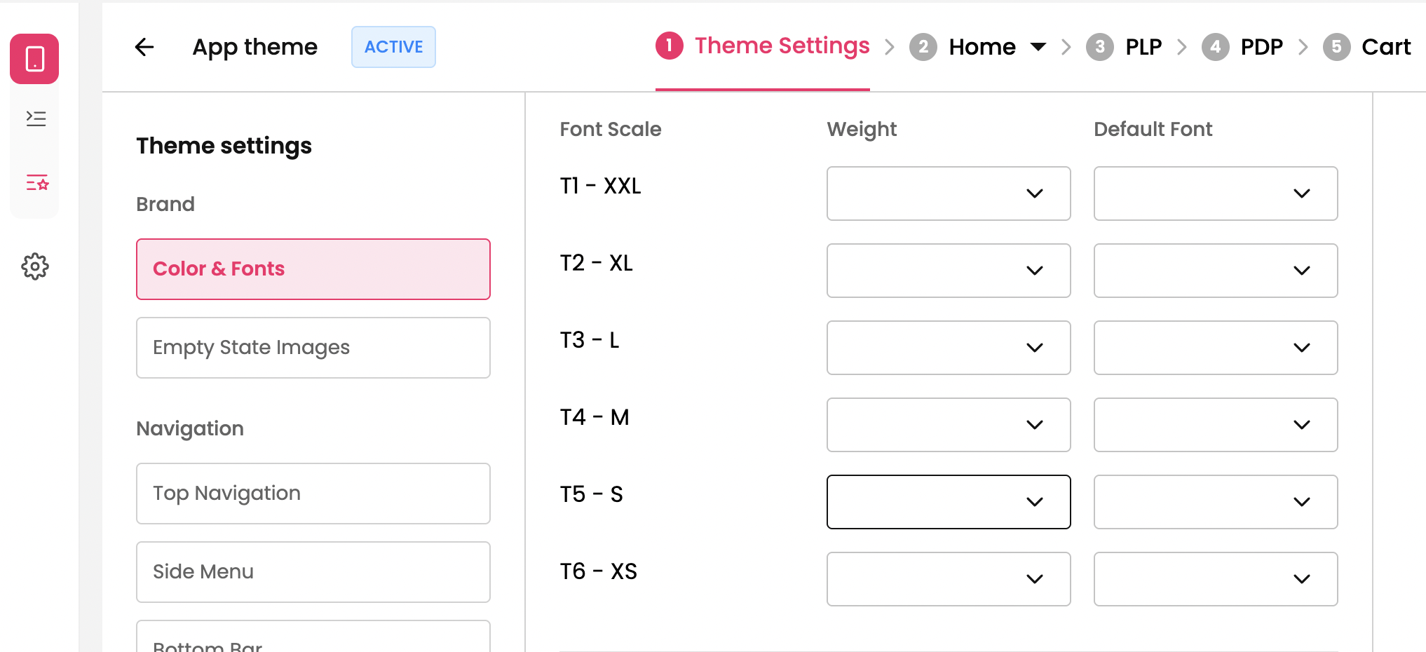
Setting up the style for Font Components
There are 6 components for the font which can be customised the way you want by setting up the weight and font style.
These components are used in our “Low Code Builder” through which you can customize your app the way you want.
Buttons are one of the most important UI elements in a mobile app. The style and color you choose should balance brand identity, usability, and modern app trends.
Step 1 : Select the theme which you want for your mobile app from theme section and click on “Theme Settings”. You’ll be redirected to the Colors and Font section in the dashboard.
Step 2 : The fourth section is for Button where you can set the button style and font for the text inside button for your app.
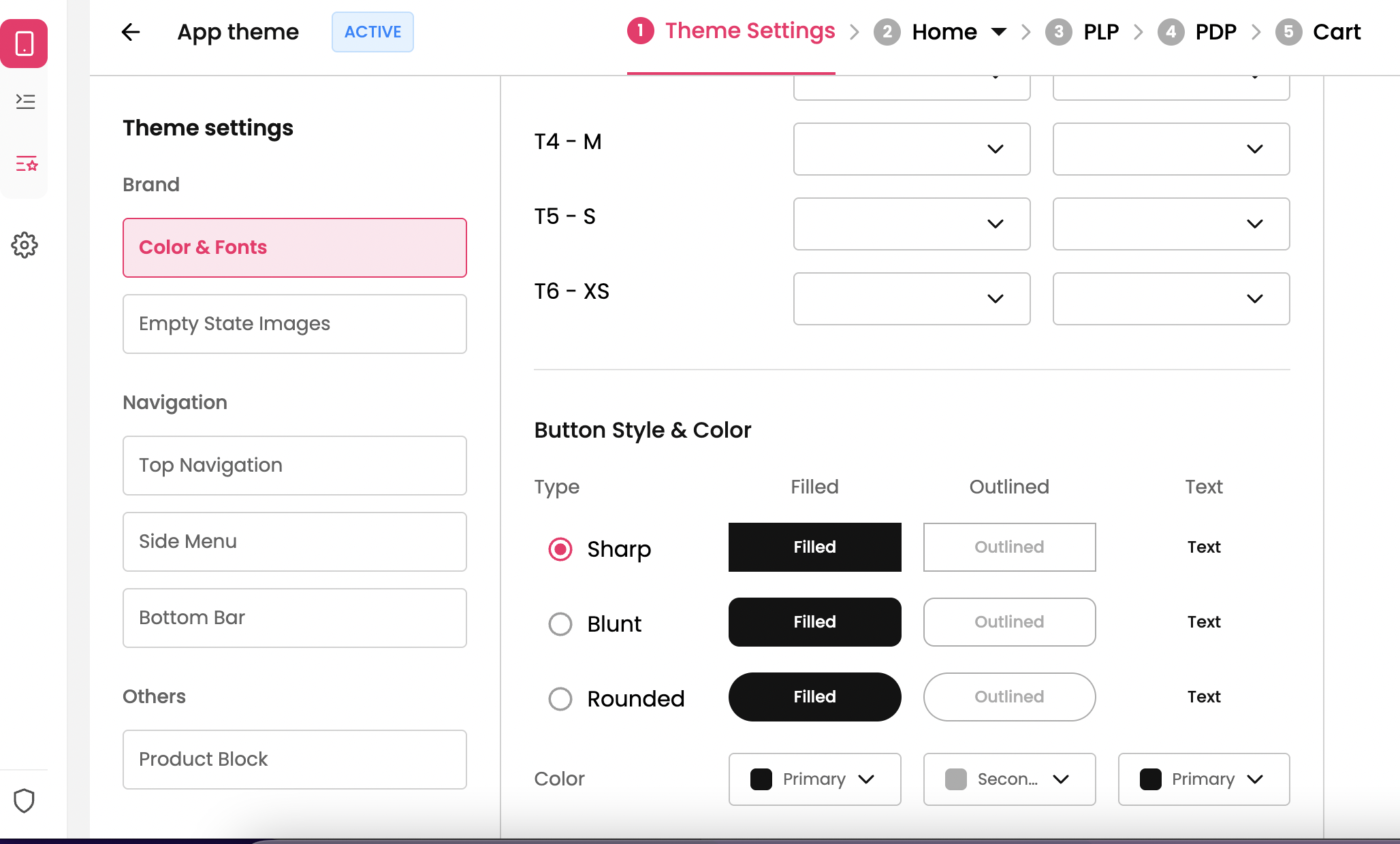
Pro Tip: Use Primary color for the buttons.