This is your central hub for design control. Theme Settings gives you the power to shape every aspect of your app's look and feel. From brand colors to navigation menus, you can tailor your app's design to perfectly align with your brand, engage your customers, and drive sales - all without any technical expertise.
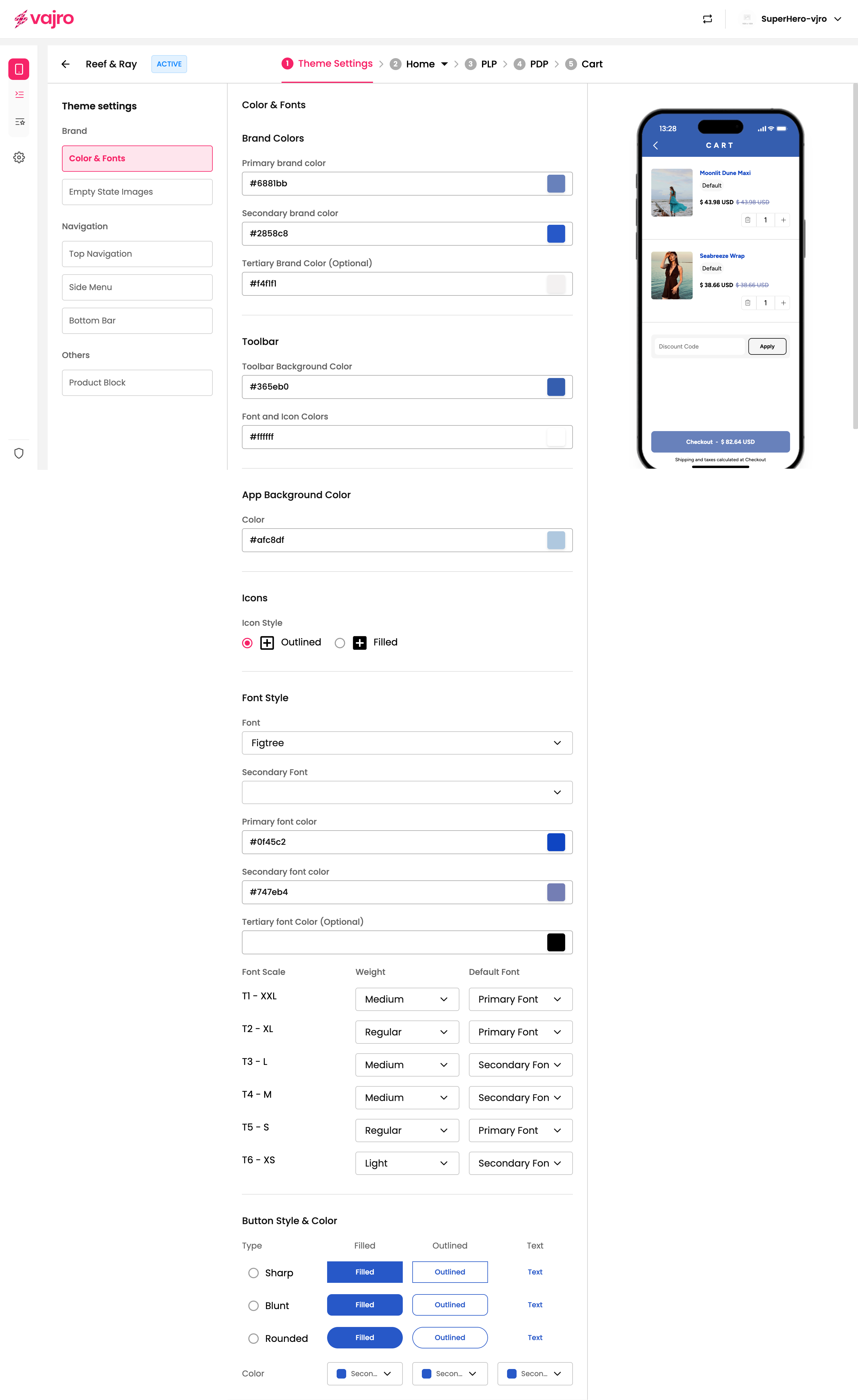
This is where your brand's visual identity comes to life. You can define your app's color scheme and typography to match your brand guidelines.
Brand Colors: Set your Primary, Secondary, and Tertiary brand colors. These will be used for buttons, headings, and other key elements.
Toolbar: Customize the background and font/icon colors of your app’s top toolbar.
App Background Color: Define the overall background color of your app screens.
Icons: Choose between Outlined or Filled icon styles.
Font Style: Select your primary and secondary fonts from a dropdown menu. You can also set a tertiary font color.
Font Scale: Adjust the size and weight of your app's text, from XXL to XS, and assign different fonts for each size.
Button Style & Color: Choose the style of your buttons (Sharp, Blunt, or Rounded) and whether they should be Filled, Outlined, or Text-based.
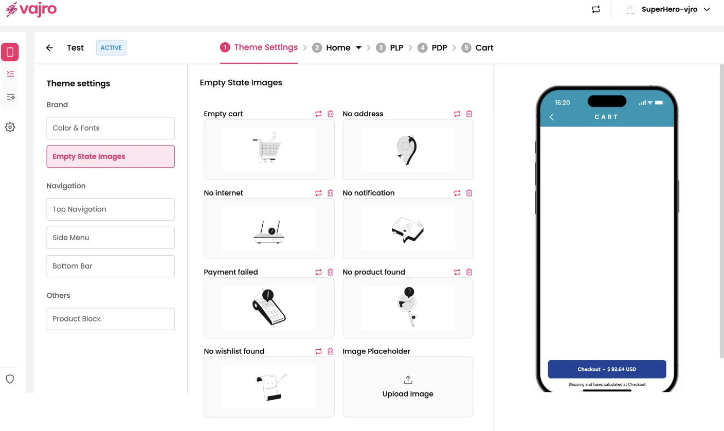
An empty state is the design a user sees when there is no content to display (e.g., an empty shopping cart or no internet connection). You can upload custom images for the following scenarios:
Empty cart
No address
No internet
No notification
Payment failed
No product found
No wishlist found
Image placeholder
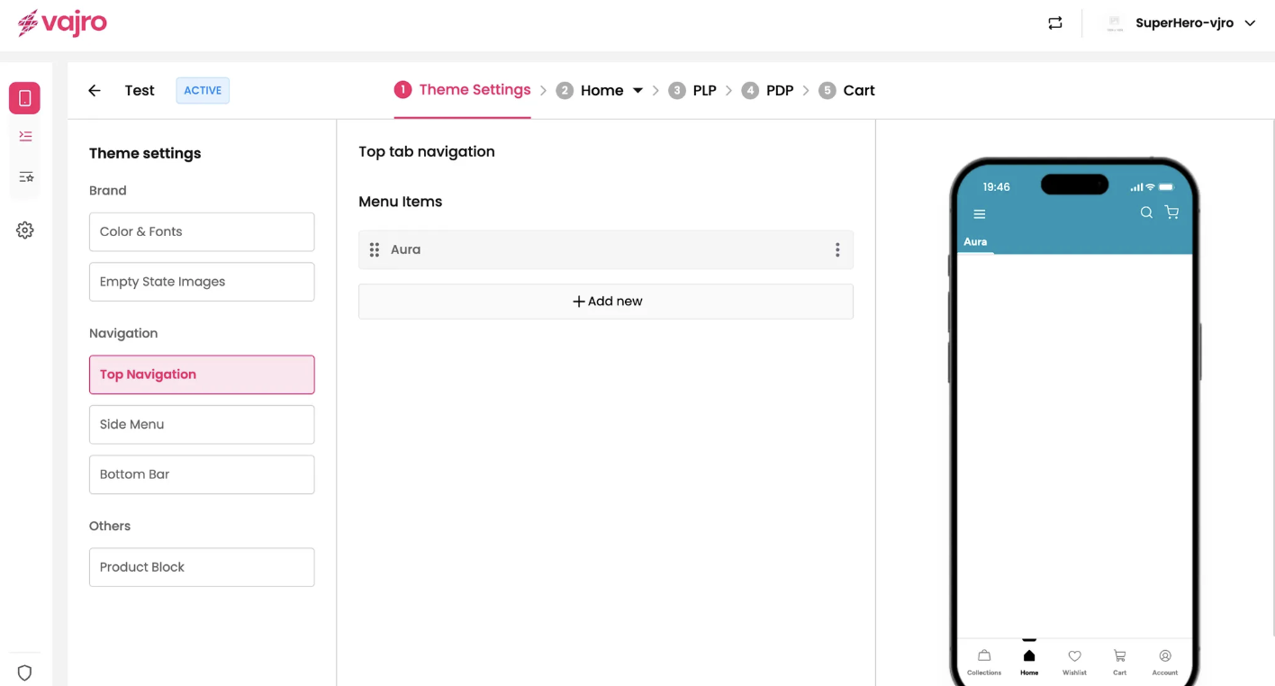
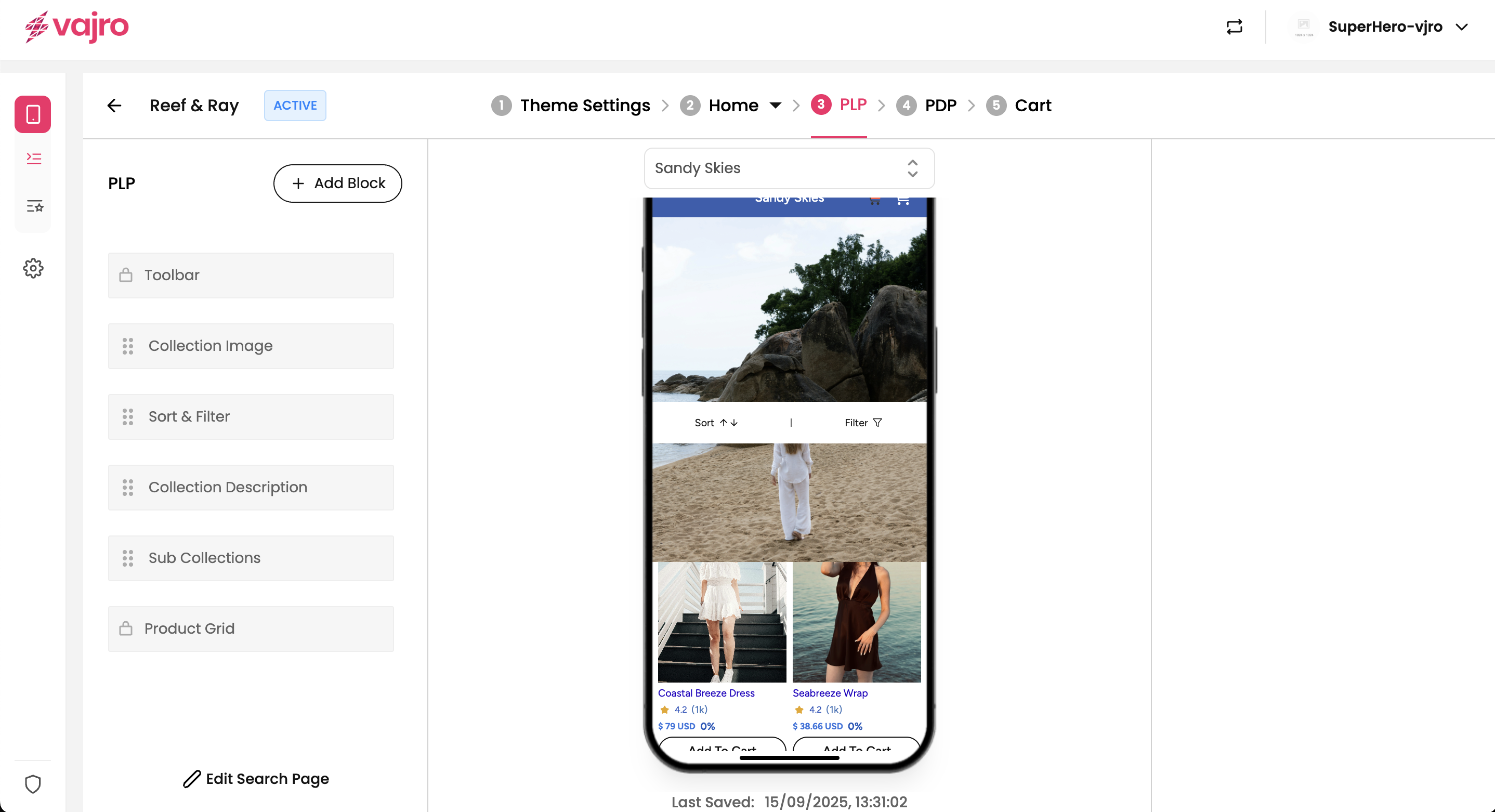
Control how your users move through your app by customizing the navigation menus.
This menu is perfect for key categories or landing pages you want to highlight at the top of your app screens.
Edit menu item: Add or modify menu items and link them to Landing Pages, a Web URL, or Custom Blocks.
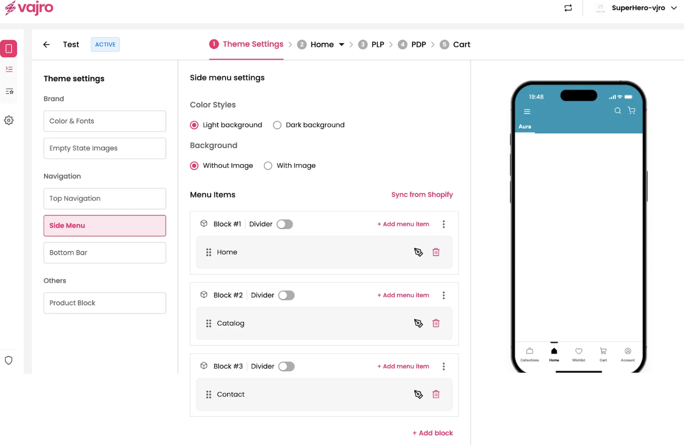
The side menu (or hamburger menu) provides a space for additional navigation links that might not fit in your top or bottom bar.
Color styles: Choose between a Light background or Dark background for your side menu.
Background: Select a background with or without an image.
Menu Items: Add, remove, or reorder menu items to fit your app's structure. You can also use Dividers to organize your links.
Sync from shopify : This feature allows you to effortlessly import your existing navigation menus from your Shopify store directly into your mobile app. This ensures consistency between your online store and your app, saving you time and effort in managing menu items.
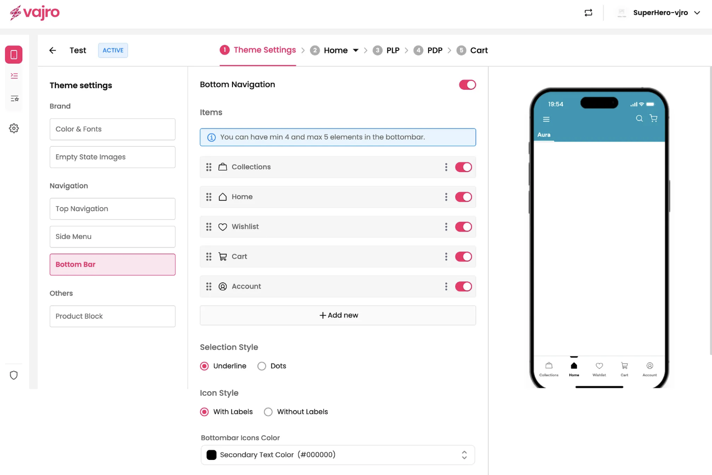
The bottom bar is a fixed menu at the bottom of your app, giving users quick access to the most important screens.
Items: Add new menu items, such as a Wishlist.
Edit menu item: Name the item, choose an icon from the Icon Library, and set the link to a System defined page, Collections, Web URL, or Custom Block.
Selection style: Choose how the active menu item is highlighted -Dots or Underline.
Icon Style: Choose whether to display the icons with or without labels.
Bottom bar icons Color: Customize the color of the icons in your bottom bar.
The product block controls how product information is displayed throughout your app, such as on product listing pages , search results, Product grid and carousel.
Product image aspect ratio: Choose from Smart Pick, Square, Portrait, or Landscape to define the shape of your product images.
Image position: Set the image to Crop or Fit within the block.
Image Corner Radius: Adjusts the roundness of product images. Higher values create more rounded corners; lower values keep them square.
Image Background Color: Define a background color for your product images.
Title text control: Decide whether the product title should Clip or Wrap.
Max Line: Controls how many lines of product title are shown -maximum is 3.
Font Variation: Set the font size for product card text - Extra Small, Small, Medium, or Large. Each section (Title, Price, Vendor) can have its own setting.
Cart Title Position: Adjusts where the product title appears -Left Aligned or Center Aligned.
Card Vendor: Card Vendor: Show or hide the product’s vendor/brand name. Customize with font size (Extra Small, Small, Meidum, Large), text alignment (Left or Center), and font color.
Add to cart button: Enable or disable a quick add-to-cart button on product blocks. You can also customize the button type, font, and color.
Show Retail Price: Toggle to show or hide the retail price.
Strike: Apply a strikethrough when the retail price is shown.
Font Variation: Extra Small, Small, Medium, or Large.
Font Color: Choose any hex color to match your theme.
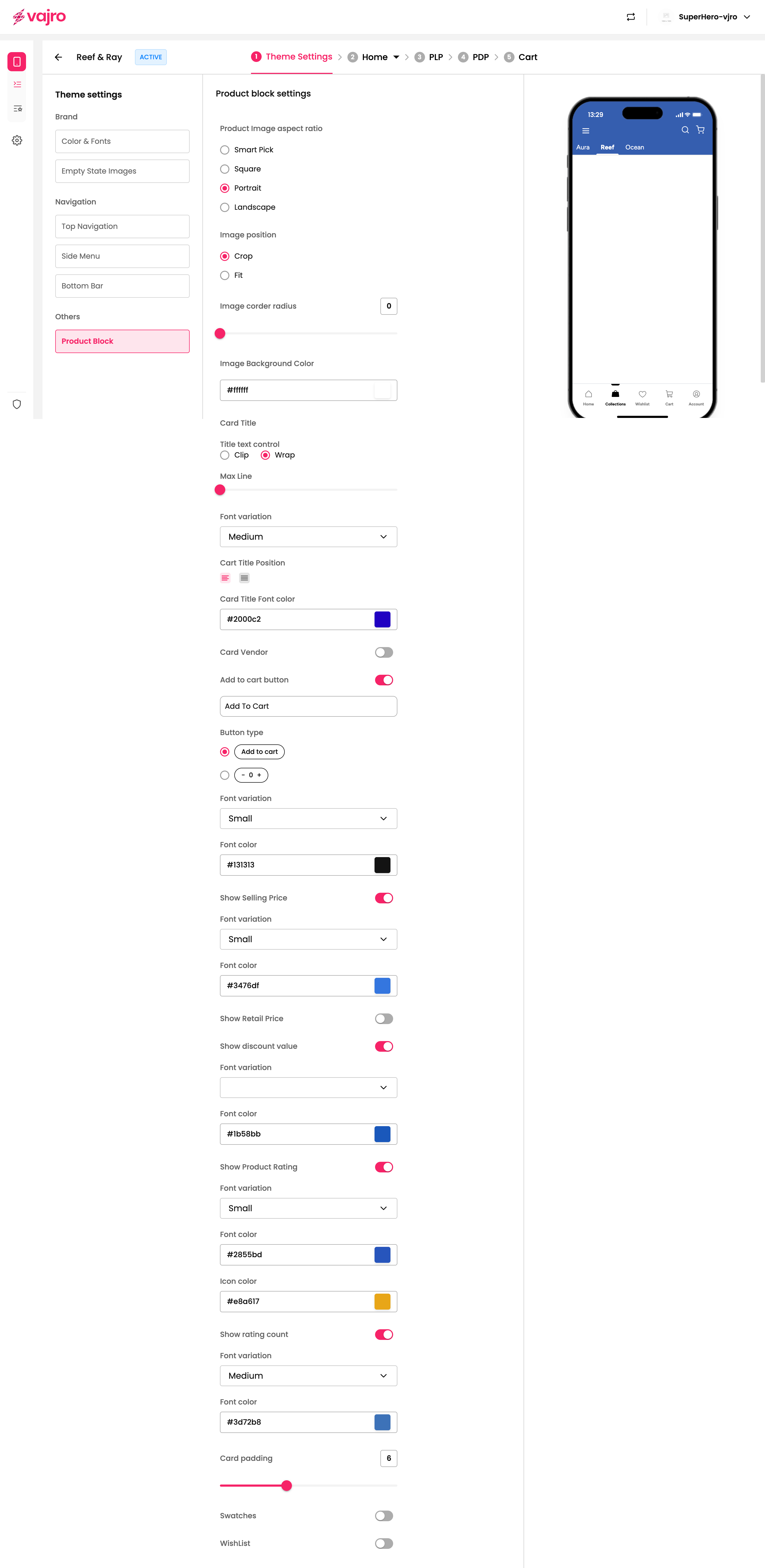
Show Discount value: Toggle this option to show or hide the discount amount on a product block. You can customize its appearance with the following settings:
Font variation: Choose the size of the discount text from options like Extra Small, Small, Medium, or Large.
Font color: Select a specific hex color to match your app's theme.
Show Product Rating: Toggle this option to display or hide the star rating for a product. You can customize its look with these settings:
Font variation: Select the font size for the rating number (e.g., Small, Medium).
Font color: Choose a font color for the rating number.
Icon color: Set the color of the rating stars themselves.
Show rating count: Toggle this to display the total number of ratings alongside the star icon.
Show rating count: Toggle this option to display or hide the total number of ratings a product has received. You can customize its appearance with the following settings:
Font variation: Choose the font size for the rating count from a dropdown menu.
Font color: Select a specific hex color to match your app's theme.
Card padding: Use the slider or the input field to adjust the spacing around the product block, giving it more or less room on the page.
Swatches: Toggle this option to show or hide color or material swatches for a product directly on the product block. This lets customers quickly see available variants.
WishList: Toggle this option to show or hide the wishlist icon on the product block.
Alignment: Choose where the wishlist icon should be positioned on the product block:
Top Left
Top Right
Right to product titles
Keep your Primary, Secondary, and Tertiary colors consistent with your brand palette.
Use high-contrast color combinations for buttons and text to ensure readability.
Limit the number of fonts (Primary, Secondary, Tertiary) to maintain a clean, cohesive design.
Apply font scaling consistently across sections to create visual hierarchy.
Avoid overly small fonts - Small is minimum, Large is maximum for product blocks.
Top Navigation: Prioritize key categories or landing pages for quick user access.
Side Menu: Group related items with dividers; avoid clutter.
Bottom Bar: Limit to essential actions (e.g., Home, Search, Wishlist, Cart, Profile).
Keep icons consistent in style (Outlined or Filled) for a polished look.
Use Smart Pick aspect ratio for auto-optimized images or Square for uniform grids.
Crop works best for standard product photography; Fit for varying image styles.
Limit product titles to maximum 3 lines to avoid visual clutter.
Enable Add to Cart button for faster conversions, but only if it complements your UX.
Show Retail Price & Strike-through for discounts to increase urgency.
Keep Card Padding minimal for denser product listings; increase it for premium layouts.
Use Swatches only when variant options (colors/materials) are relevant.
Position Wishlist icon at Top Right for better visibility.
Use consistent illustration style across empty states.
Keep messaging short and action-oriented (e.g., “No products found - Start shopping!”).
1. Can I use different fonts for Title, Price, and Vendor?
Yes, each section has its own Font Variation control (Extra Small to Large).
2. What is the maximum number of lines for product titles?
Maximum is 3 lines.
3. Will changing brand colors affect my buttons and headings automatically?
Yes, Primary, Secondary, and Tertiary brand colors propagate across buttons, headings, and key UI elements.
4. Can I upload custom icons for navigation menus?
Currently, you can only choose from the built-in Icon Library.
5. Can I have both Top Navigation and Side Menu?
Yes, but use them strategically -Top for priority items, Side for extended navigation.
Define Brand Identity: Finalize your brand colors, typography, and button styles first.
Set Navigation Hierarchy:
Choose Top Navigation items based on priority.
Organize Side Menu with dividers and minimal clutter.
Configure Bottom Bar with 4-5 key items.
Optimize Product Blocks:
Select aspect ratio and image corner radius.
Decide on font variations and alignments (Left or Center).
Enable key features (Wishlist, Swatches, Ratings).
Test User Experience:
Preview your app in multiple screen sizes.
Ensure text is readable and buttons are accessible.
Sync with Shopify (if applicable): Keep menus, product data, and empty states in sync.
Gather Feedback: Soft-launch with selected users and iterate.
Publish & Monitor: Go live, track conversions, and refine design as needed.