Capture your customers' attention and showcase multiple products, promotions, or brand stories in a single, interactive block. The Image Slider allows you to create a dynamic carousel of images that users can swipe through.
Customize your image slider and its individual tiles using the controls on the right panel.
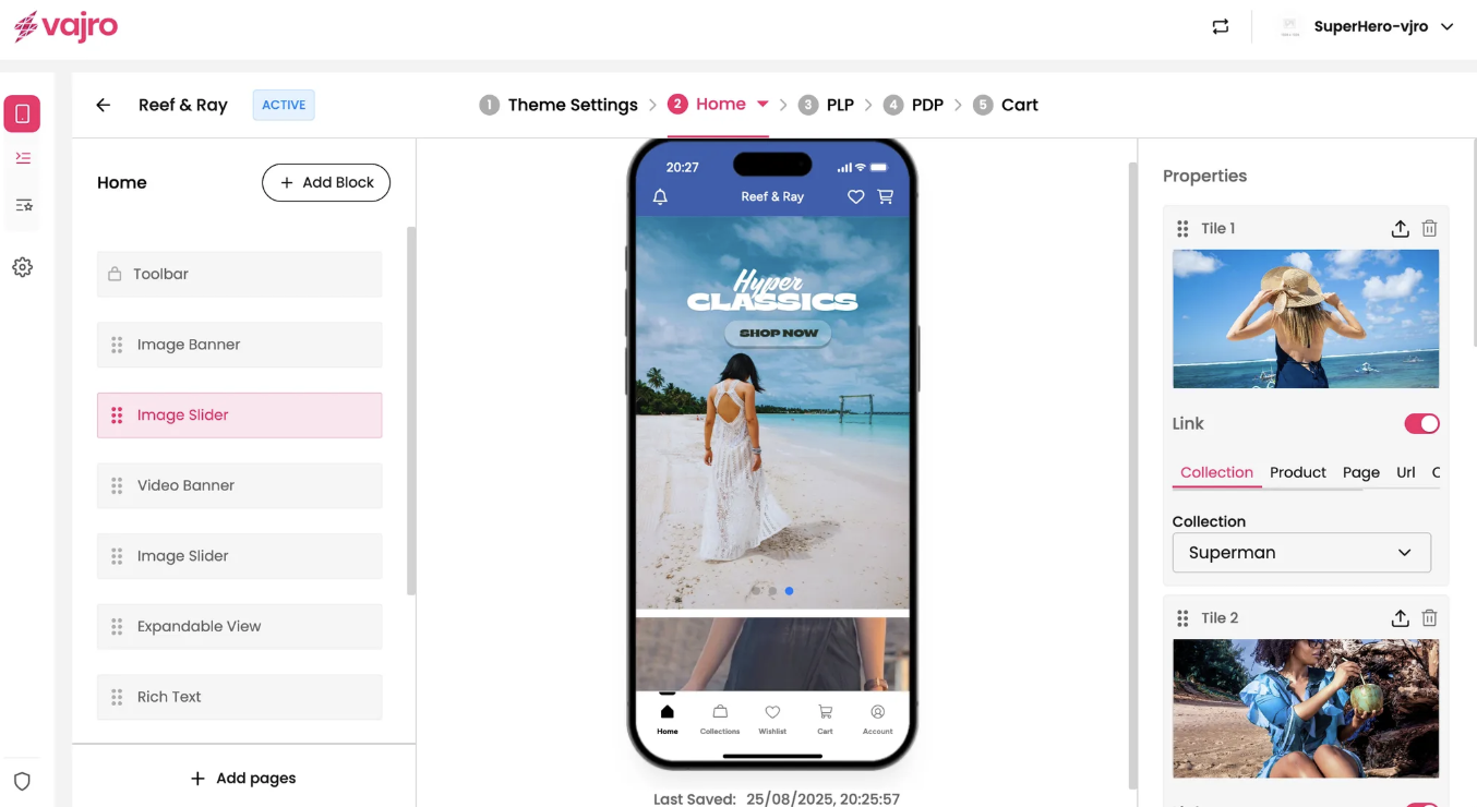
This is where you manage the individual images within your slider.
Tile: Each image you add to the slider is called a "Tile."
Upload Image: Click the upload icon next to each tile to add a new image. You can add as many tiles as you need to build your carousel.
Drag to Reorder: Easily rearrange the order of your tiles by dragging the six-dot handle next to the title.
Delete Tile: Click the trash can icon to remove a tile from the slider.
Link: The Link toggle works for each individual tile. When enabled, your customers will be taken to a specific page when they tap on that particular image.
Link To: Choose where you want the tile to lead. You have the same options as the Image Banner:
Collection: Direct customers to a specific product collection.
Product: Link to a single product page.
Page: Send customers to a custom app page.
URL: Use a custom URL to link to an external website or a specific deep link.
Custom Block: Set a custom link.
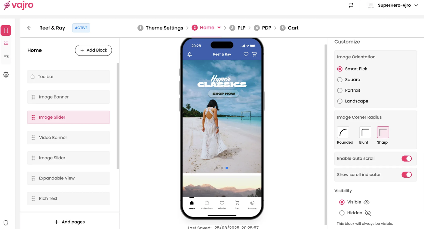
Fine-tune the appearance and functionality of your entire Image Slider block.
Image Orientation: This controls how all the images in the slider are displayed.
Smart Pick: Intelligently adjusts each image to fit the best orientation for the user's device.
Square: Displays all images in a 1:1 ratio.
Portrait: Optimizes all images for a vertical (tall) display.
Landscape: Optimizes all images for a horizontal (wide) display.
Image Corner Radius: Control the style of the slider's corners.
Rounded: Gives the slider's images soft, curved corners.
Blunt: Uses a slightly less rounded corner.
Sharp: Keeps the corners perfectly square and crisp.
Enable auto scroll: When this toggle is active, the images in your slider will automatically scroll from right to left, creating a looping effect.
Show scroll indicator: This toggle displays small dots at the bottom of the slider, indicating how many images are in the carousel and which one is currently being viewed.