Your app’s settings are designed to give you maximum flexibility in tailoring the shopping experience. From how products are displayed to the way customers log in and see prices, each setting ensures that your app reflects your brand and improves conversions.
Easily manage how out-of-stock products appear in your app to control customer experience.
Features & Controls
Out of Stock: Decide how unavailable products are shown.
Properties Panel
Hide: Out-of-stock products won’t appear in your store, keeping the catalog clean.
Show: Products will still be visible but marked as unavailable, allowing customers to see the full range of your offerings.
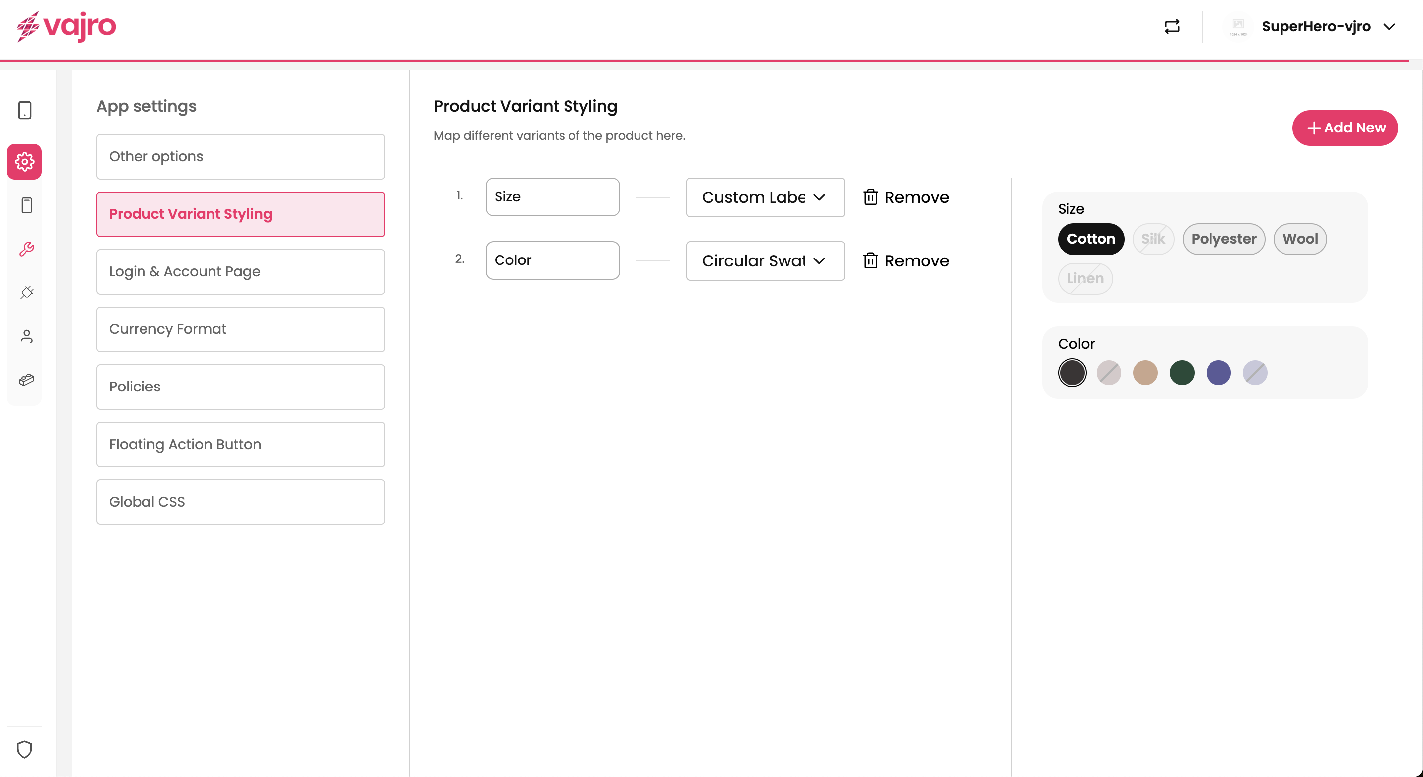
Enhance the way customers explore product options by customizing how variants (like size, color, or material) are displayed.
Features & Controls
You can map and style product variants directly within the settings.
Properties Panel
Variant Mapping: Assign attributes such as Size, Color, or Material.
Style Options: Choose how variants look in your app.
Circular Swatches: Ideal for color options, displayed as small round icons.
Square Swatches: Display options in a square format for better visibility.
Size / Custom Label: Show variants as labeled buttons (e.g., S, M, L).
Customization
Add New: Easily add more variant types like Fabric, Pattern, or Fit.
Remove Option: Delete unnecessary variants with a single click.
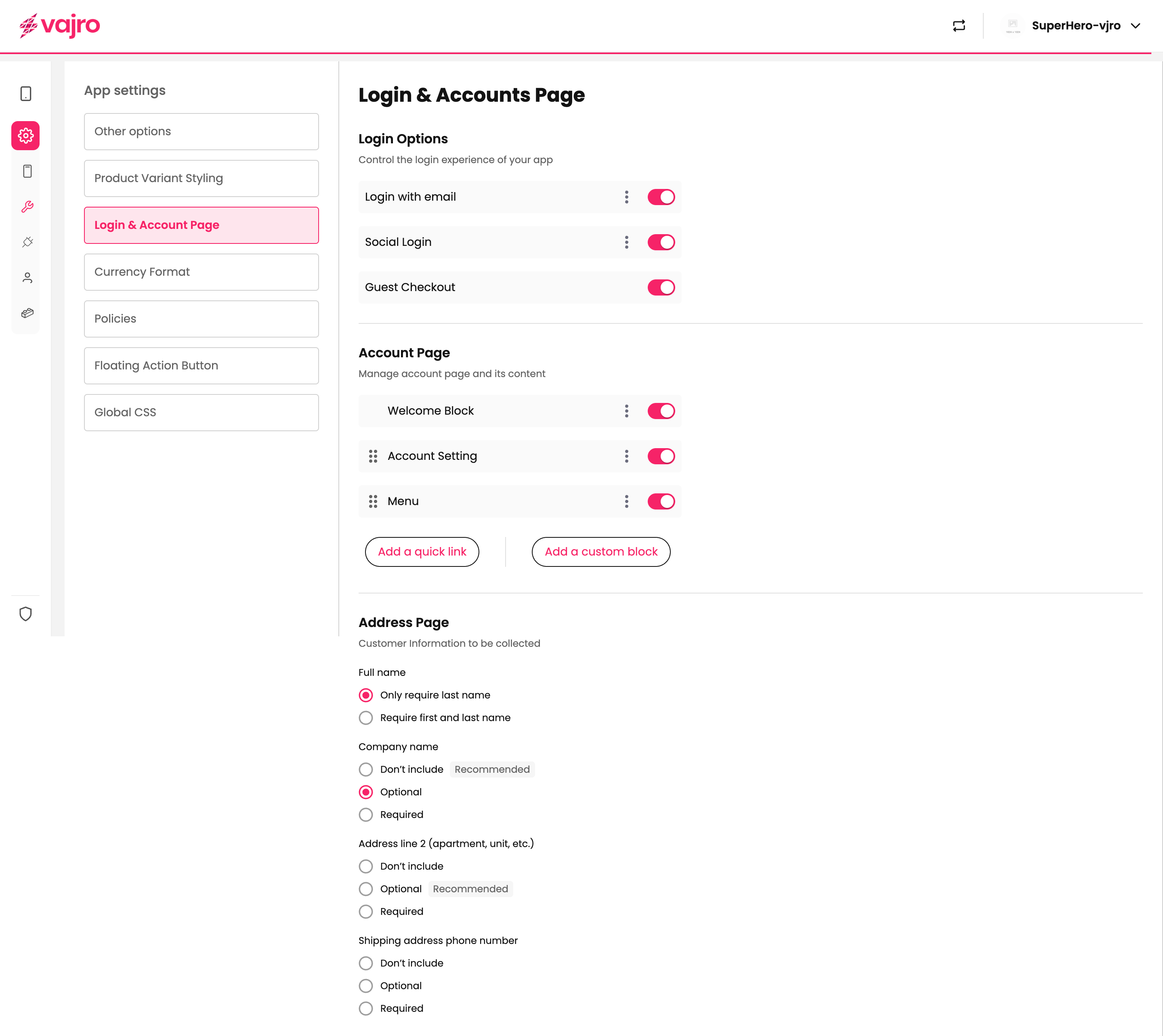
Customize how customers sign in and manage their accounts for a seamless shopping journey.
Features & Controls
Login Options:
Login with Email – Standard login option.
Social Login – Allow customers to use Google, Facebook, or Apple ID.
Guest Checkout – Enable quicker purchases without account creation.

Account Page Blocks: Control what customers see in their profile.
Welcome Block – Greet customers personally.
Account Setting – Give users control of their details.
Menu – Provide quick navigation.
Address Page Settings: Decide what customer info you want to collect.
Full Name: Require full name or only last name.
Company Name / Address Line 2 / Phone Number: Choose between Don’t Include, Optional, or Required based on your business needs.
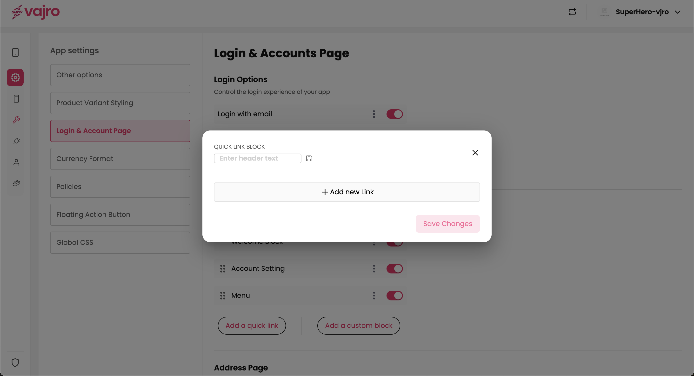
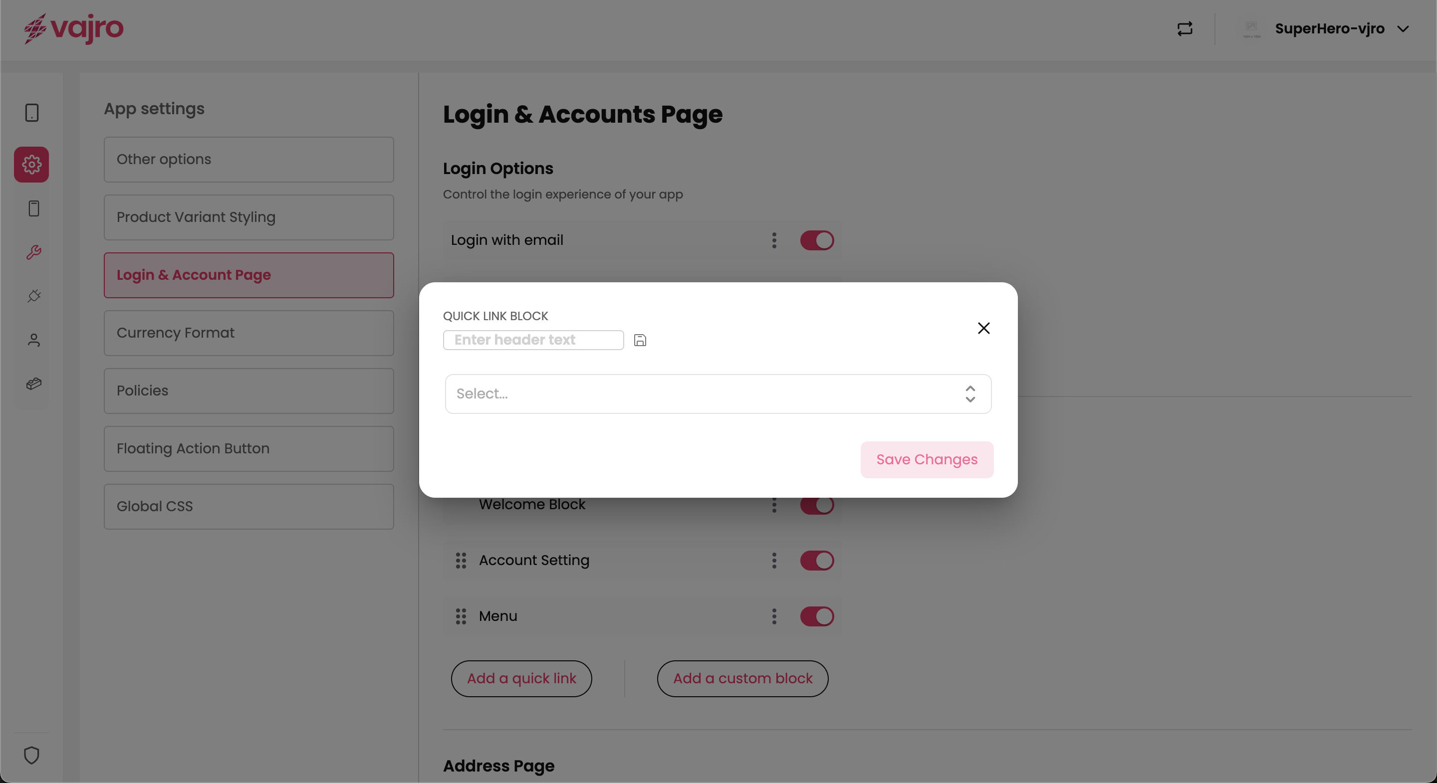
From the Login & Account Page settings, you have the option to add two types of custom content blocks: Quick Link Block and Custom Block.
Add a Quick Link
This feature allows you to create a simple link that can be added to the account page or other relevant sections. It's a quick way to direct users to a specific destination.
How to Use:
Click the Add a quick link button.
A pop-up will appear titled QUICK LINK BLOCK.
Enter header text: Type in the display name for your link (e.g., "My Orders," "Help Center").
Select (dropdown): Choose the destination for the link. This could be a native app page (like your cart or order history), a specific product collection, or an external URL.
Click Save Changes to add the link to your app.
Add a Custom Block
This option gives you full control to design a custom content area using a visual editor. This is ideal for creating more complex sections, such as a personalized welcome banner or a unique promotional area.
How to Use:
Click the Add a custom block button.
This will open a content editor where you can build a block from scratch.
You can add various elements like text, images, and buttons to create a branded section.
The block is fully customizable and will adapt to different screen sizes.
Once your design is complete, save the block to add it to your app's account page.
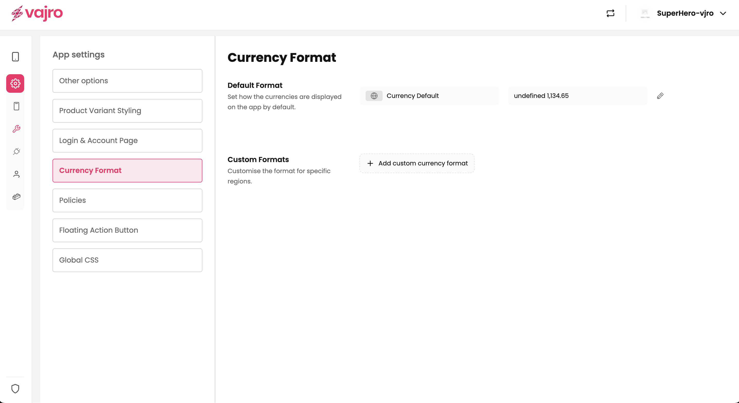
Deliver a localized shopping experience by controlling how prices appear across your app.
Features & Controls
Default Format: Set a global currency display that will be applied across your app by default.
How to Use: Click the edit icon next to "Default Format" to open the customization pop-up.
Format: Use the available tags - {{symbol}}, {{amount}}, and {{currency_code}} to arrange the display order. For example, {{symbol}} {{amount}} will display the currency symbol followed by the amount (e.g., $1,299.99). You can add spaces or other text between the tags.
Sample Preview: As you arrange the format, a live preview will show you exactly how the price will appear to customers.
Custom Formats: Add region-specific currency formats to cater to different markets.
How to Use: Click "Add new" to create a custom currency format.
Currency: Select the specific currency you want to customize from the dropdown menu.
Format: Just like with the default format, arrange the {{symbol}}, {{amount}}, and {{currency_code}} tags to create a tailored display (e.g., 1299.99 USD or USD 1299.99).
Sample Preview: A live preview helps you visualize the final result.
Customization By combining these elements, you can create tailored displays to match regional conventions and provide a seamless shopping experience for all your customers:
$1299.99
1299.99 USD
USD 1299.99
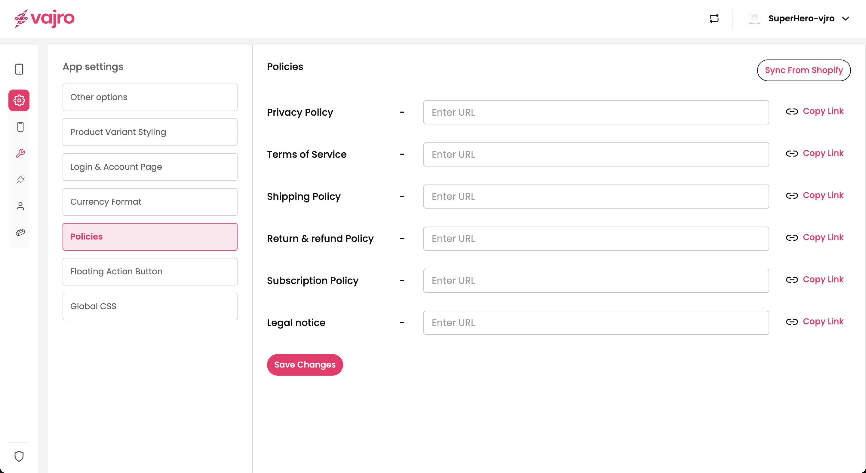
Manage your store's policies to build customer trust and ensure clarity. You can link to your existing policy pages, such as those for refunds, privacy, and terms of service, making them easily accessible within the app.
Features & Controls
Policy Links: Add, edit, or remove links to various policies.
Properties Panel
Policy Name: A user-friendly name for the policy (e.g., "Refund Policy," "Privacy Policy," "Terms of Service").
URL: The full web address (URL) where the policy is hosted.
Customization
Add New Policy: Add a new policy link to a page hosted on your website.
Reorder: Arrange the policies in any order you prefer, giving prominence to the most important ones.
Delete: Remove policies that are no longer needed.
Visibility: Control on which pages the Floating Action Button is displayed.
Home: The main home screen of the app.
PDP (Product Detail Page): The page showing a single product's details.
PLP (Product Listing Page): A page displaying a list of products, typically within a collection.
Cart: The customer's shopping cart page.
Order: The order history or details page.
Sync from Shopify This feature allows you to instantly import your existing policies from your connected Shopify store, saving you time and ensuring consistency.
How to Use:
Click the Sync from Shopify button.
The app will automatically detect and pull in your existing Refund, Privacy, and Terms of Service policies etc.
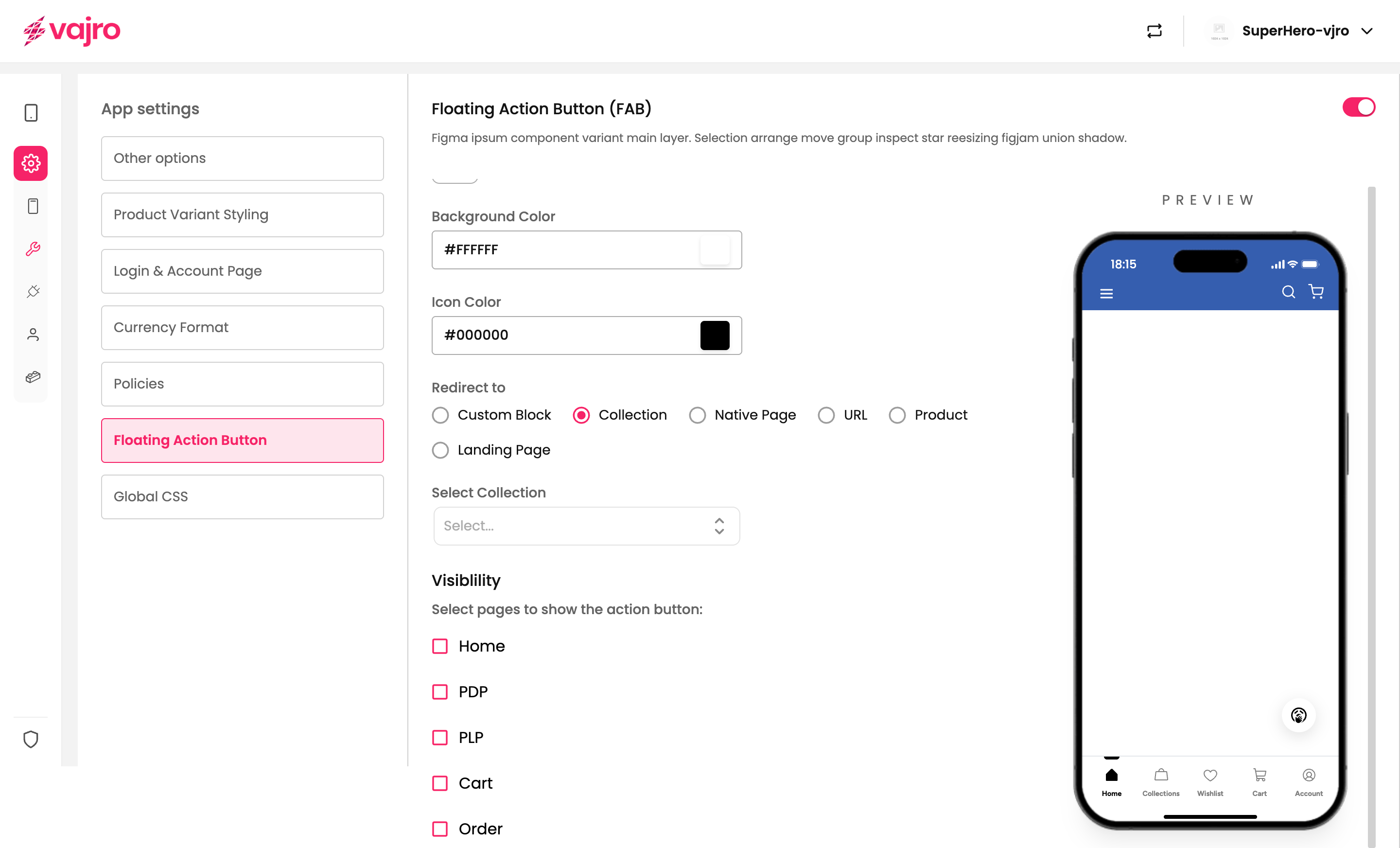
Elevate the shopping experience in your app by setting up a Floating Action Button (FAB). This prominent button is a key tool for guiding customers toward the most important action on a page, making it instantly accessible and impossible to miss.
Appearance Control the look and feel of your FAB to match your app's branding and design.
Shape: Choose from three distinct shapes:
Circle: The classic, default FAB shape.
Rounded: A rounded square.
Sharp: A square with defined corners.
Icon & Image: You have two options for the visual element of the FAB.
Icon: Select an icon from our comprehensive library that represents the action (e.g., a cart, chat bubble, or phone).
Image: Upload a custom image to use as your FAB.
Colors: Customize the FAB’s colors to stand out. Use the color pickers to set the Background Color and Icon Color via hex codes.
Redirect to Define where the button sends the user when they tap on it. You can redirect them to specific pages or external links to streamline their journey.
Custom Block: Directs the user to a specific content block you have created within the app.
Collection: Links to a specific product collection page.
How to Use: After selecting this option, click the Select Collection dropdown to choose from a list of all your available product collections (e.g., "Marvel collection," "DC," or "All").
Native Page: Links to a built-in app page like the cart or account page. This is ideal for directing users to core functions of your app.
How to Use: After selecting this option, click the Select Page dropdown to choose from a list of standard app pages such as Orders, Accounts, Cart, PDP (Product Detail Page), and PLP (Product Listing Page).
URL: Links to any external website or internal page using a full URL.
Product: Links directly to a single product detail page.
Landing Page: Links to a specific landing page you have created within the Vajro builder.
Visibility: Selecting Pages Control where your Floating Action Button appears to create a seamless user experience. By choosing specific pages, you can ensure the FAB is only shown where its action is most relevant.
How to Use: In the "Visibility" section, simply check the box next to each page where you want the FAB to be displayed.
Examples: You can select pages like:
Home: For a global, primary action.
PDP (Product Detail Page): To encourage an "add to cart" or "buy now" action.
PLP (Product Listing Page): To allow users to filter or sort products.
Cart: To initiate checkout.
Orders, Accounts, and Address pages.
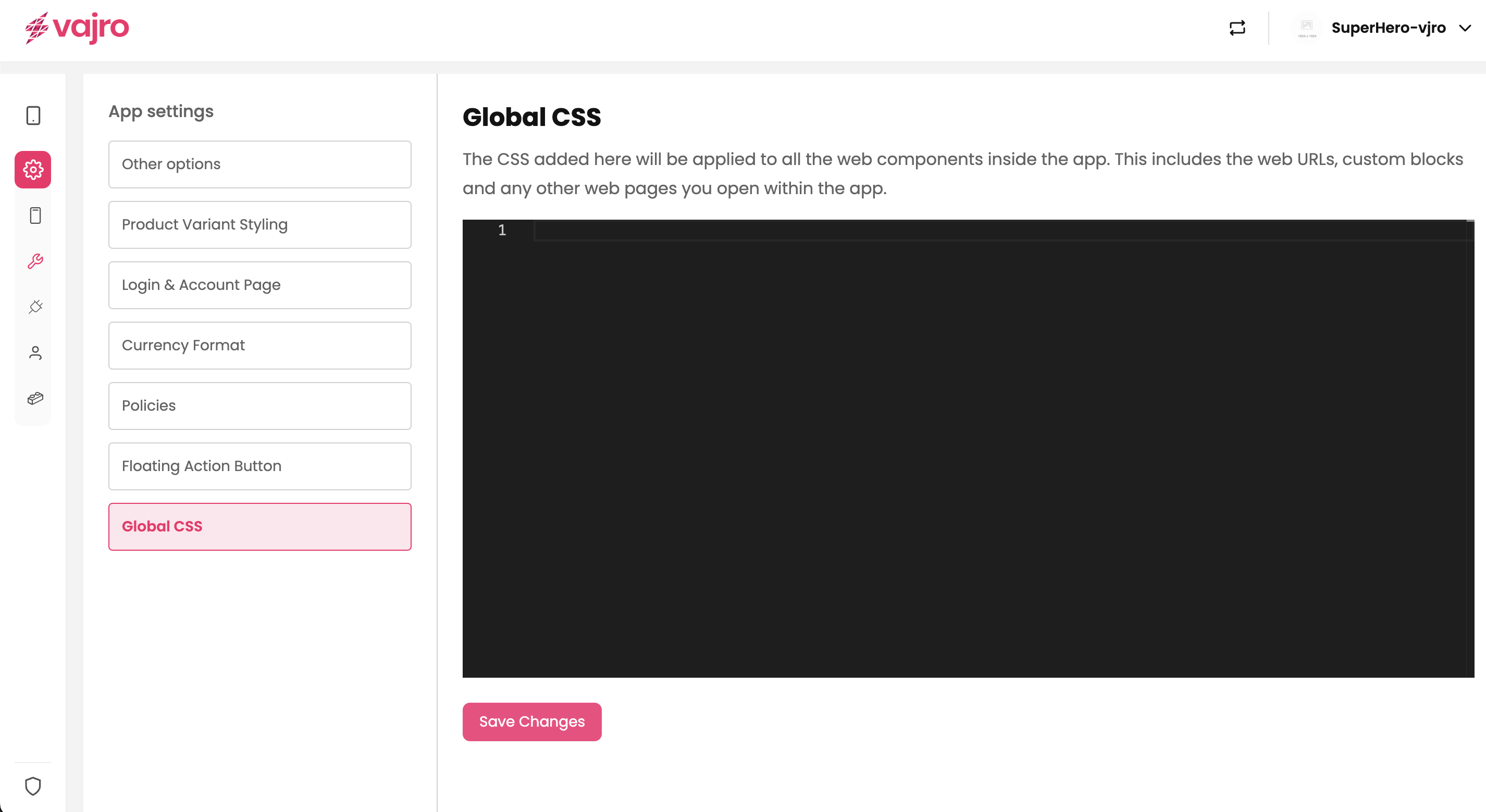
Apply custom CSS to your app to ensure a consistent and unique brand identity. This setting allows you to add custom stylesheets that will affect all web components and web pages within your app.
Features & Controls
Custom CSS Editor: A dedicated code editor where you can write and paste CSS rules.
Application: The CSS you add here will be applied globally to all web components, custom blocks, and any other web pages opened within your app.
Save Changes: Click "Save Changes" to apply your new CSS rules to the app's design.
Keep the catalog clean by hiding unavailable items, or show them transparently to build trust.
Standardize variant names and visuals so customers quickly understand their options.
Offer multiple login methods, but highlight the fastest path (social login or guest).
Use quick links for essential destinations, and custom blocks for branded experiences.
Match currency formats to local conventions to avoid confusion.
Place policy links in high-trust areas like Cart and Order History.
Assign one clear purpose to the Floating Action Button so it never distracts.
Keep CSS minimal and brand-aligned, test changes before rolling them out.
1.Can customers shop without logging in?
Yes, enable guest checkout for frictionless purchasing.
2.How do I decide between hiding or showing out-of-stock products?
Hide if you want a clean storefront; show if you want to display your full range.
3.Can I mix quick links and custom blocks?
Absolutely, they complement each other.
4.Do currency changes require an app resubmission?
No, edits apply instantly.
5.What if a CSS update causes layout issues?
Go to the Global CSS editor and either remove the problematic code to revert back or tweak the rules until the layout looks correct. Your changes will apply instantly across the app.
Review your stock visibility rules
Style and organize product variants
Enable login methods that match your customer base
Personalize the account page with links and blocks
Set default and regional currency formats
Add and reorder policy links for clarity
Configure a FAB with one key action
Apply CSS tweaks carefully for brand consistency
Test your app across devices to confirm a smooth experience