Elevate your app's visual appeal and promote new collections, sales, or campaigns with a standout Image Banner. This versatile block allows you to showcase a single, high-impact image that grabs your customers' attention.
Show one high-impact image.
Make it clickable and link to collections, products, pages, or websites.
Adjust the image size, orientation, and corner style to match your brand.
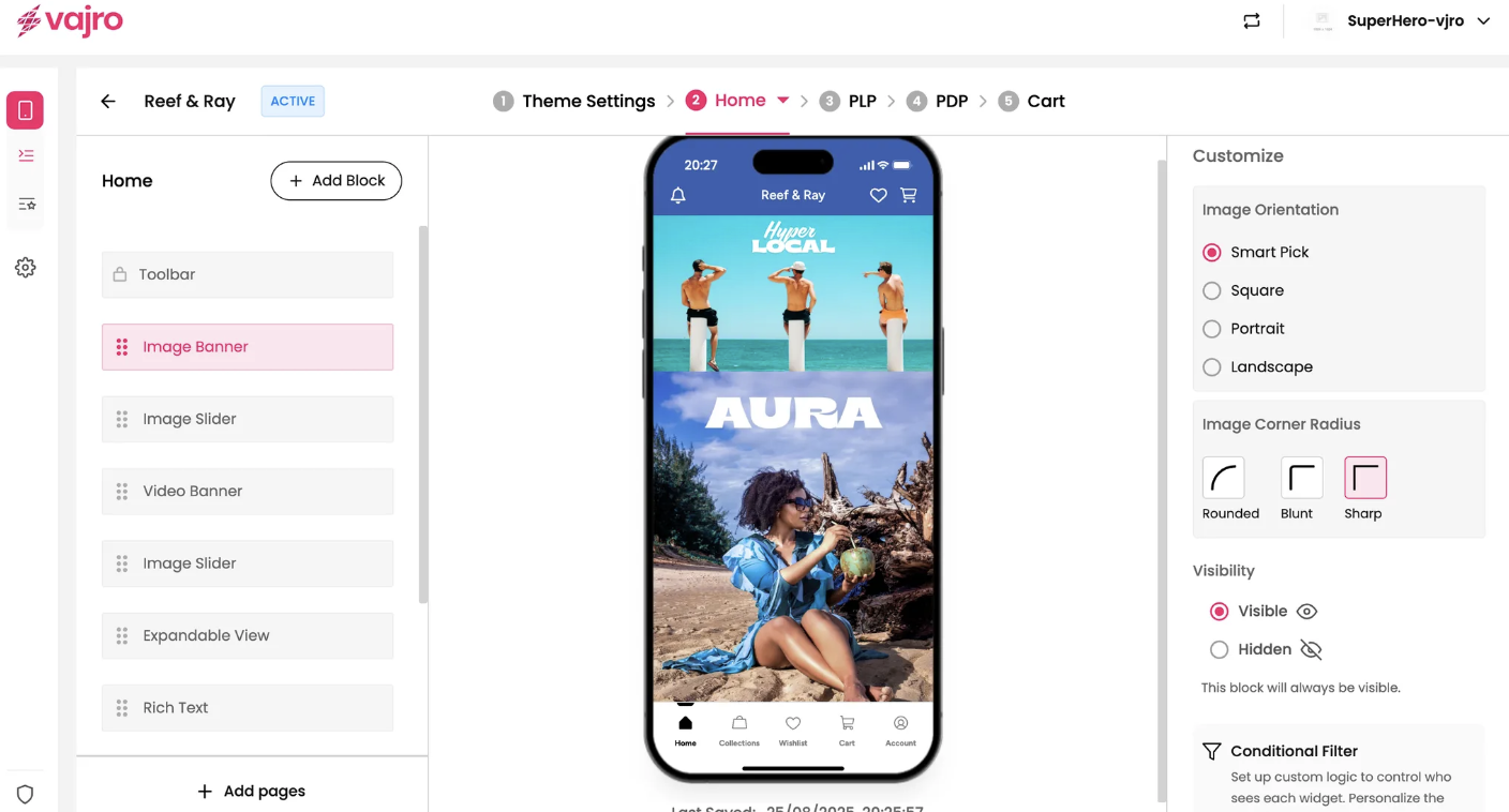
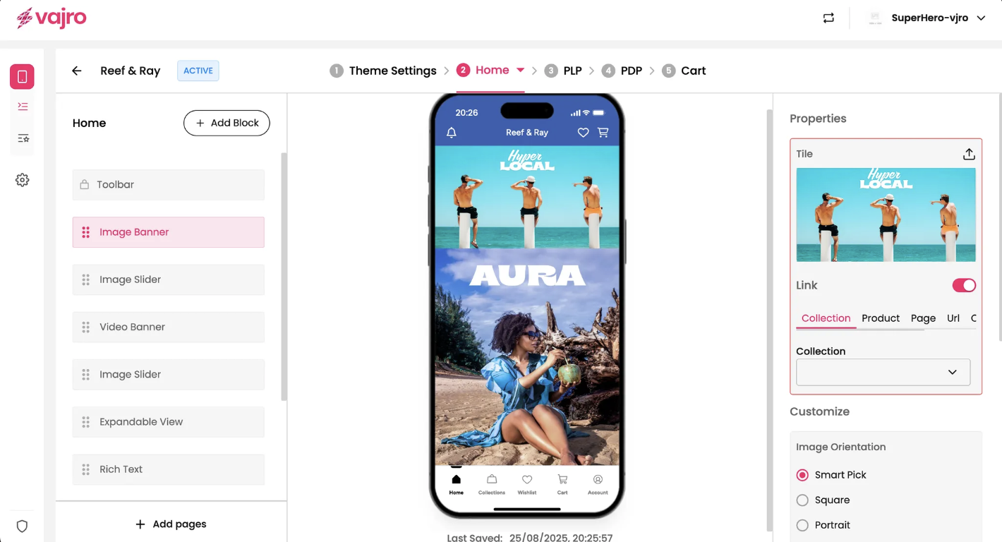
This section is where you set up your image banner.
Upload Image: Click the upload icon to add your image. For the best display across different devices, choose a high-quality image that looks great in both portrait and landscape orientations.
Link: The Link toggle lets you decide whether your banner is clickable. When enabled, your customers will be taken to a specific page when they tap the image.
Link To: Choose where you want the banner to lead. You have several options:
Collection: Direct customers to a specific product collection (e.g., your "New Arrivals" collection).
Product: Link to a single product page.
Page: Send customers to a custom app page you've created.
URL: Use a custom URL to link to an external website or a specific deep link within your app.
Custom Block: This option allows you to set a custom link based on your app's specific needs.
Fine-tune the appearance of your Image Banner to perfectly match your brand aesthetic.
Image Orientation: This setting controls how the image is displayed within the app's frame.
Smart Pick: This intelligent option automatically adjusts the image to fit the best orientation for the user's device, ensuring a seamless look on both phones and tablets.
Square: Displays the image in a 1:1 ratio.
Portrait: Optimizes the image for a vertical (tall) display.
Landscape: Optimizes the image for a horizontal (wide) display.
Image Corner Radius: Control the style of the banner's corners.
Rounded: Gives the banner soft, curved corners for a modern feel.
Blunt: Uses a slightly less rounded corner for a subtle effect.
Sharp: Keeps the corners perfectly square and crisp.