The CTA (Call-to-Action) block is a critical element on your PDP, typically a button that prompts the customer to take a specific action, such as "Add to Cart." This block helps to convert page visitors into customers by providing a clear and direct path to purchase.
The properties panel for the CTA block allows you to customize its appearance, behavior, and content.
This section is where you manage the visual presentation and functionality of your CTA button.
Style: Choose a button style that best fits your app's design from the three available options.
Outlined CTA: This toggle allows you to create a button with a transparent background and a colored border, matching the CTA color.
Label Copy: You can customize the text that appears on the CTA button (e.g., "Add To Cart").
Label Size: Use the slider to adjust the size of the text on the button.
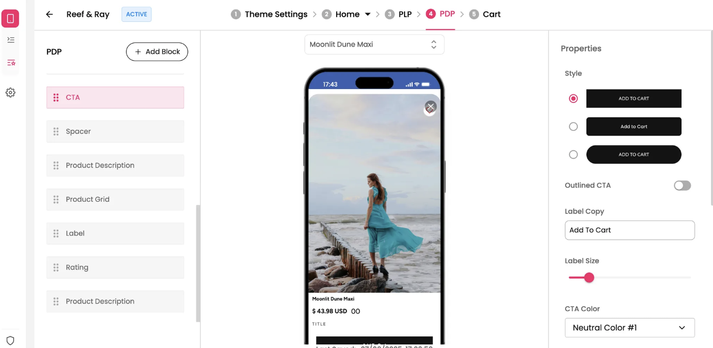
CTA Color: Choose the color of the button's background and/or border.
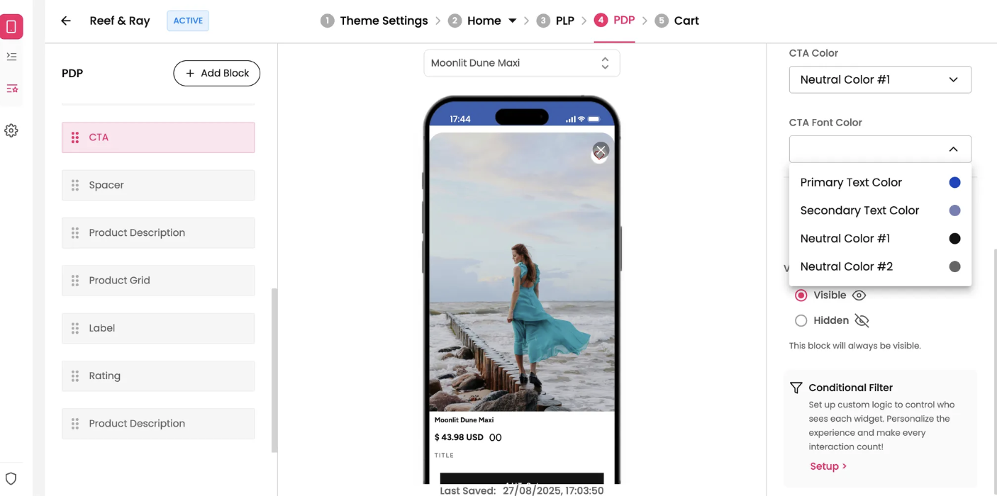
CTA Font Color: Set the color of the text on the button.
Scroll Style: This setting controls the button's behavior as the user scrolls.
Inline: The button remains in its place on the page and scrolls with the rest of the content.
Fixed at Bottom: The button stays fixed at the bottom of the screen, always visible to the user as they scroll. This is a powerful feature for encouraging a purchase.