The Product Description block provides customers with detailed information about the product. This information helps them understand the product's features, benefits, and specifications, which is vital for making an informed purchase.
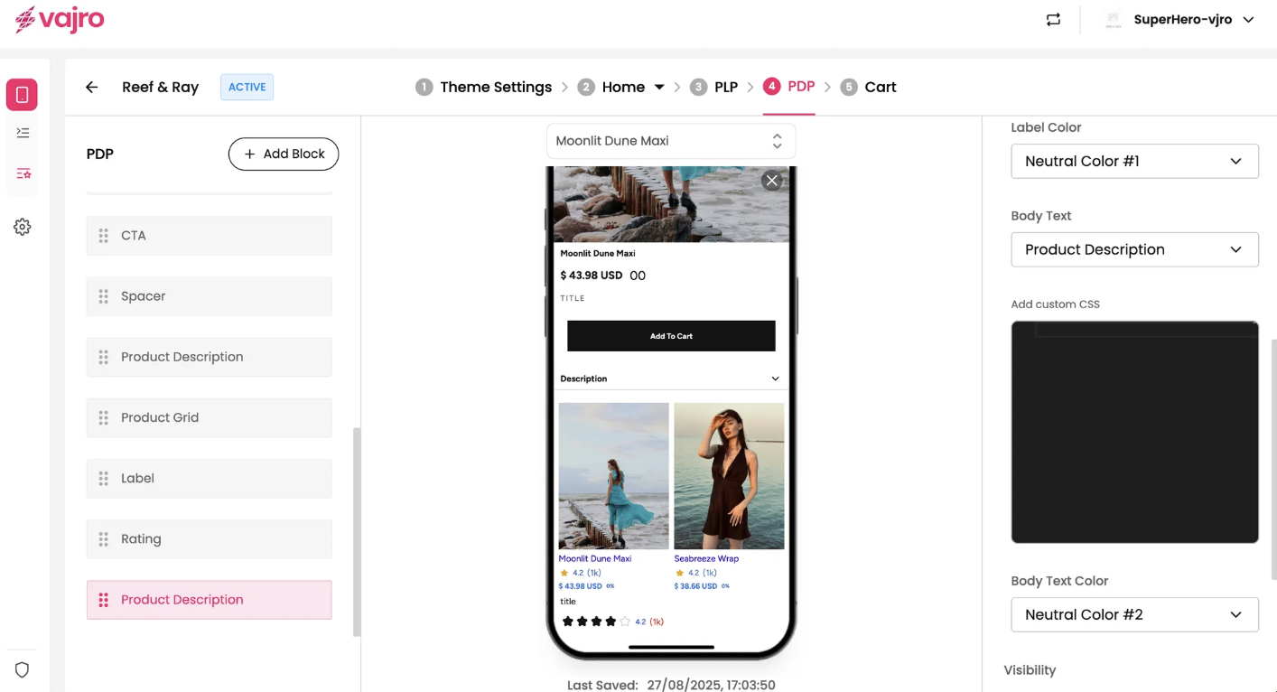
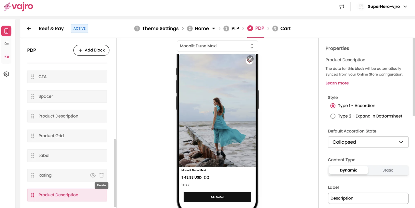
The properties panel for the Product Description block allows you to customize its style, content, and appearance on the page.
This section is where you manage the visual presentation and content source for your product description.
Style: Choose how the description is displayed.
Type 1 - Accordion: The description is initially collapsed and can be expanded by clicking on it.
Type 2 - Expand in Bottomsheet: The description expands into a full-screen bottom sheet when clicked, providing a more immersive view.
Default Accordion State: If you use the Accordion style, you can set its default state to be Collapsed or Expanded.
Content Type: Choose between Dynamic or Static content.
Dynamic: The description automatically syncs with the data from your Online Store configuration.
Static: You can manually enter a description that will not change based on your online store data.
Label: Customize the text that appears as the title of the description block (e.g., "Description").
Label Color: Choose the color of the label text.
Body Text: Select the font and size for the main body of the description. The font options are typically tied to your theme settings.
Body Text Color: Set the color of the description text.
Add custom CSS: This feature allows you to add custom CSS to apply specific styles to the description block that aren't available through the standard properties panel.