The Product Grid block on the PDP is an important tool for displaying products related to the item the customer is currently viewing. It helps increase discoverability and can encourage additional purchases. This widget automatically pulls products from a collection you choose, making it a powerful and efficient way to drive sales and product discovery from any app page.
The properties panel for the Product Grid block allows you to specify which products should be displayed and how they are presented.
This section is where you manage the data source for your product grid, as well as its visual style.
Title color: You can customize the color of the title text that appears above the product grid.
View all button: You can toggle the visibility of a "View All" button. This button is often used to lead customers to a full collection or a list of all related products.
Font variation: You can choose a different font size for the grid title, such as "Small" as shown in the screenshot.
Font color: Customize the color of the grid title.
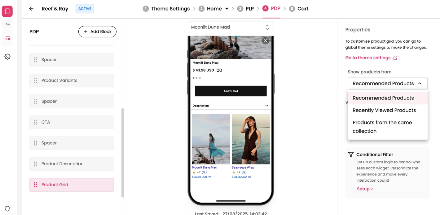
Show products from: This setting allows you to select the source for the products in this grid, ensuring the content is relevant to your customer's browsing experience.
Recommended Products: Displays products that your system recommends based on a customer's browsing history or preferences.
Recently Viewed Products: Shows products the customer has recently viewed, which can help them revisit items they may have forgotten.
Products from the same collection: Displays other products that belong to the same collection as the current product, encouraging further exploration of a category.