The Product Block allows you to display products on your homepage or other pages, giving your customers a visually appealing and interactive way to browse items. Customize the layout, appearance, and interactive elements to match your brand and optimize the shopping experience.
The design of the product images in your grid (like aspect ratio, corner radius, and padding) is managed globally to ensure consistency across your app.
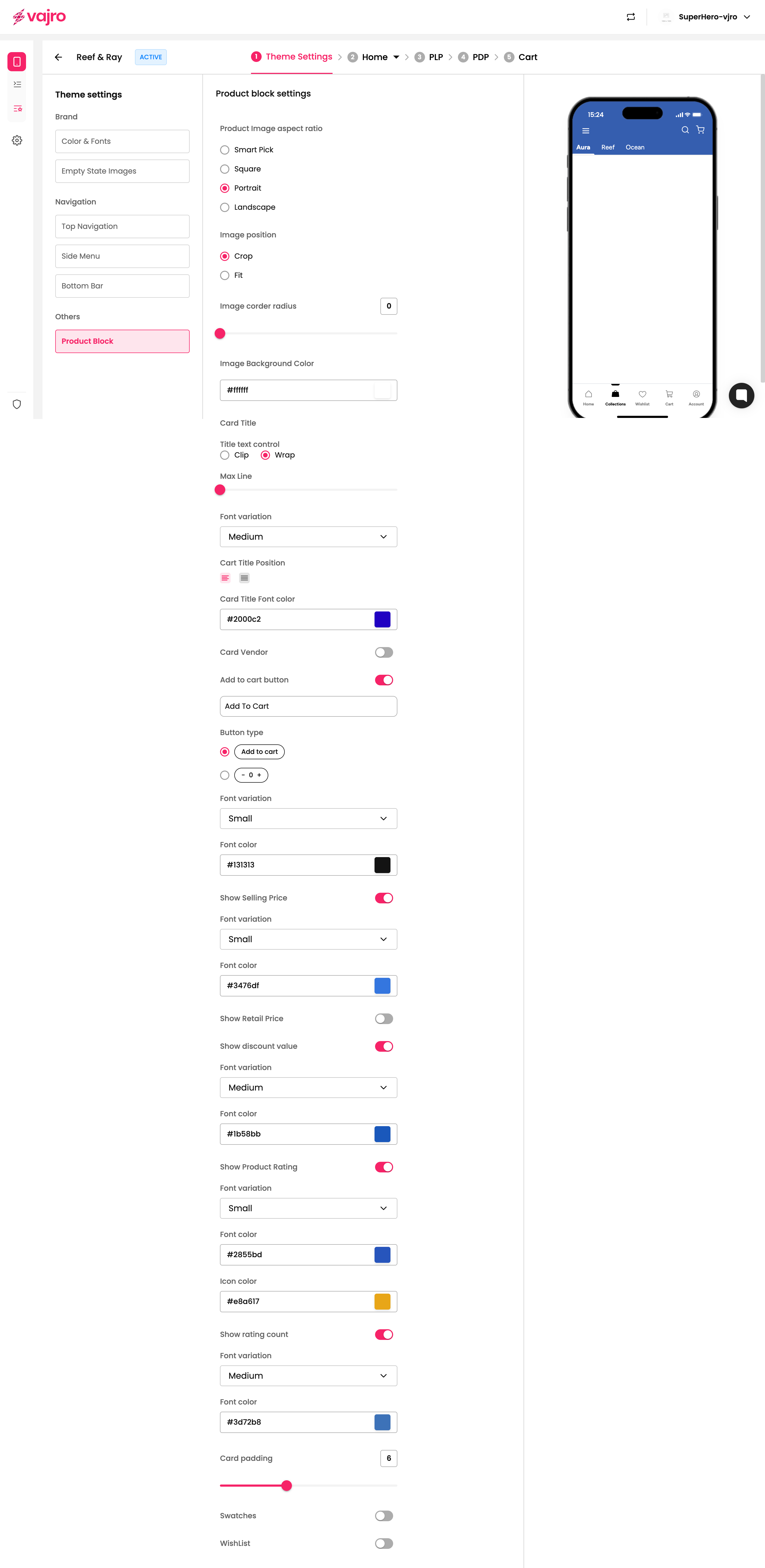
To make these changes, navigate to Theme settings > Product Block.
Display products in a clean, responsive grid.
Choose product image aspect ratio (Square, Portrait, Landscape, or Smart Pick).
Crop or fit images for a polished look.
Control product title display and font styles.
Show or hide selling price, retail price, discounts, ratings, and rating counts.
Add "Add to Cart" button in different styles.
Customize card padding, colors, and typography.
Optionally enable swatches and wishlist buttons.
This is where you configure the appearance and behavior of your Product Block.
Product Image Aspect Ratio:
Smart Pick: Automatically selects the best aspect ratio for the device.
Square: 1:1 image ratio.
Portrait: Tall image ratio, ideal for vertical layouts.
Landscape: Wide image ratio, ideal for horizontal layouts.
Image Position:
Crop: Focuses on the center of the image while cropping edges.
Fit: Adjusts the image to fit the container without cropping.
Image Corner Radius:
Adjust the roundness of image corners. Enter a number to increase or decrease the radius. The maximum corner radius for images is 16.
Image Background Color:
Set a background color behind the product image to complement your brand.
Title Text Control:
Clip: Truncates the title if it’s too long.
Wrap: Allows the title to wrap onto multiple lines.
Max Line: Limit the number of lines to 3 for title display.
Font Variation: Choose from Small, Medium, or Large.
Card Title Position: Left or Center alignment.
Card Title Font Color: Set the font color using HEX codes or color picker.
Toggle ON to display the vendor/brand of the product.
Toggle ON to show an Add to Cart button.
Button Text: Customize the text (e.g., "Add to Cart").
Button Type:
Add to Cart Button: Default cart button.
Quantity Selector: Include + / - controls for quantity selection.
Font Variation & Color: Customize button text size and color.
Show Selling Price: Toggle to display the current price.
Show Retail Price: Toggle to display the original price.
Show Discount Value: Toggle to display the discount percentage or amount.
Font Variation & Color: Customize size and color for each price element.
Show Product Rating: Toggle to display star ratings.
Font Variation & Color: Customize font size and color for ratings.
Icon Color: Set the color of the star icons.
Show Rating Count: Toggle to display the number of ratings.
Font Variation & Color: Customize font size and color for rating count.
Adjust the padding inside the product card to control spacing around elements (maximum 16).
Swatches: Toggle to display color or style options for the product.
Wishlist: Toggle to enable a wishlist button for customers.
Keep the image aspect ratio consistent for a clean, professional look.
Use high-contrast colors for titles and prices to ensure readability.
Display ratings and discount values to increase engagement and conversions.
Balance padding to avoid clutter but maintain visibility of all product details.