Display your best-selling or newly launched products in a beautifully organized grid or carousel format with the Product Grid block. This widget automatically pulls products from a collection you choose, making it a powerful and efficient way to drive sales and product discovery from any app page.
Customize your Product Grid using the controls on the right panel.
This section controls the content and basic layout of your product grid.
Add a collection: This button allows you to add a new product block to your page.
Link: Use this dropdown to select the specific product collection/homepage/ All you want to display in this grid.
Number of products to show: Use the slider to set exactly how many products from your chosen collection will be displayed in the widget.
Widget display type: Choose the layout for your products.
Grid: Displays products in a clean, multi-column grid layout, perfect for showcasing a large number of products at once.
Carousel: Organizes products in a single row that users can swipe through, ideal for highlighting a few items without taking up too much vertical space.
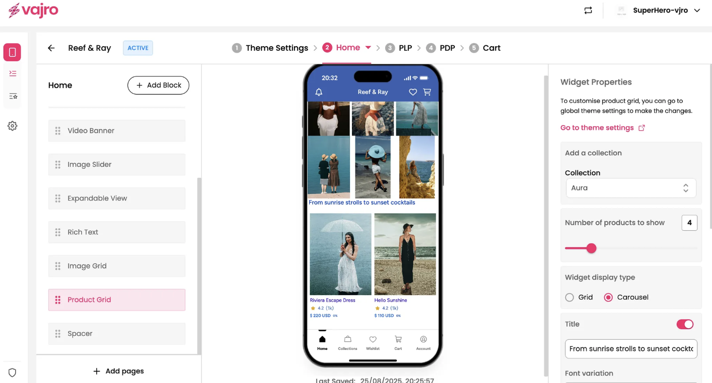
Title: Use the toggle to add a title to your product grid (e.g., "From sunrise strolls to sunset cocktails").
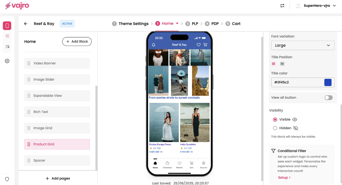
Font variation: Choose a size for your title (e.g., "Large").
Title Position: Adjust the alignment of your title (e.g., left, center).
Title color: Use the color picker to set the color of your title text.
View all button: Enable this toggle to add a button that links customers to the full product collection page.